
Subprime Mortgages:
What, Where, and to Whom?
Prepared for the Lincoln Land Institute Conference Honoring Chip Case on December 7, 2007. The authors wish to thank Alex Chinco, Erik Hembre, Rembrand Koning, Christy Pinkston, and Julia Zhou for extremely dedicated research assistance. We thank Bob Avery, Ken Brevoort, Brian Bucks, Glenn Canner,
Karen Dynan, Andreas Lehnert, Kristopher Rengert, Shane Sherlund, Dan Sokolov, and participants at the Homer Hoyt Institute, the AREUEA Mid-Year Meeting, and the Lincoln Land Institute Conference in honor of Karl Case for many helpful comments and thoughts. Mayer wishes to especially thank Chip
Case for his friendship and mentorship throughout his career. The paper represents the opinions of the authors and does not represent the views of the Federal Reserve Board or its staff.
Keywords: Mortgages, subprime, and house prices
Abstract:
We explore the types of data used to characterize risky subprime lending and consider the geographic dispersion of subprime lending. First, we describe the strengths and weaknesses of three different datasets on subprime mortgages using information from LoanPerformance, HUD, and HMDA. These datasets embody different definitions of subprime mortgages. We show that estimates of the number of subprime originations are somewhat sensitive to which types of mortgages are categorized as subprime. Second, we describe what parts of the country and what sorts of neighborhoods had more subprime originations in 2005, and how these patterns differed for purchase and refinance mortgages. Subprime originations appear to be heavily concentrated in fast-growing parts of the country with considerable new construction, such as Florida, California, Nevada, and the Washington DC area. These locations saw house prices rise at faster-than-average rates relative to their own history and relative to the rest of the country. However, this link between construction, house prices, and subprime lending is not universal, as other markets with high house price growth such as the Northeast did not see especially high rates of subprime usage. Subprime loans were also heavily concentrated in Zip codes with more residents in the moderate credit score category and more black and Hispanic residents. Areas with lower income and higher unemployment had more subprime lending, but these associations are smaller in magnitude.
Over the last two years, the housing market has turned sharply in many parts of the country. House prices have swung from steady rates of appreciation to outright declines, while sales and construction of new homes have dropped steeply. Much of this turmoil appears related to the boom and bust in mortgage markets over the last five years.
It was not supposed to work out this way. Securitization and other innovations in mortgage markets led to new loan products with the potential to make home ownership easier and more accessible to buyers who could not access credit previously through conventional means. These so-called subprime and near-prime mortgage products allowed buyers with lower credit scores, smaller downpayments, and/or little documentation of income to purchase houses. These new products not only allowed new buyers to access credit, but also made it easier for home owners to refinance loans and withdraw cash from houses that had appreciated in value.
Despite the economic implications of the credit boom and bust, there have been only a handful of studies on who received subprime loans during this most recent housing cycle, where these loans were made, and what the loans were used for. In part, the lack of studies is due to data limitations. The most timely source of data on subprime loans, data from LoanPerformance (LP), is not freely available to researchers. In addition, there is no consensus among either lenders or researchers about what types of mortgages should be considered subprime.
We begin to fill this void in this paper. We focus our empirical analysis in two areas. First, we describe the strengths and weaknesses of three different datasets on subprime mortgages. These datasets embody different definitions of subprime mortgages. We show that estimates of the number of subprime originations are somewhat sensitive to which types of mortgages are categorized as subprime. Second, we describe what parts of the country and what sorts of neighborhoods had more subprime originations in 2005, and how these patterns differed for purchase and refinance mortgages.
We believe that we are the first researchers to examine this second question -- the geographic dispersion of subprime lending -- with the LP data, although previous studies have examined this question with other datasets (US Department of Housing and Urban Development, 2000; Scheessele, 2002; Calem, Gillen, and Wachter, 2004; Avery, Canner, and Cook, 2005; Center for Responsible Lending, 2006; Consumer Federation of America, 2006; Brooks and Ford, 2007). However, analyses of other mortgage topics have also used the LoanPerformance data (Brooks and Simon, 2007; Demyanyk and Van Hemert, 2007; Gerardi, Shapiro, and Willen, 2007; Keys et al, 2008; Pennington-Cross and Ho, 2006).
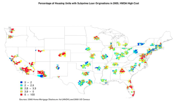
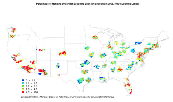
Turning to our paper's first focus, we examine three sources of data on subprime mortgages: mortgages in securitized pools marketed as subprime by the securitizer (LoanPerformance); mortgages with high interest rates (HMDA higher-priced); and mortgages originated by lenders specializing in subprime mortgages (HMDA HUD lender). The three measures paint quite different pictures of the number of subprime originations. In 2005, the most recent year all three measures are available, the average number of originations per 100 housing units in Zip codes in metropolitan statistical areas (MSAs) ranges from 3.6 (LP) to 5.4 (HMDA higher-priced).
The measures also portray the growth in subprime originations differently. The LP measure implies that subprime originations grew seven-fold from 1998 to 2005, whereas the HMDA HUD measure implies that originations tripled over this period. The difference between the two measures appears to stem from growth in subprime securitization over these years. If we restrict the HUD measure to originations that were securitized, the two series track each other closely in most years. These findings suggest that which measure captures the subprime market best may vary as the market structure evolves over time.
Turning to our second focus, we next explore what areas of the country and what types of neighborhoods experienced the most subprime originations. Here the three measures tell a consistent story. As has been reported in the press, metropolitan areas in Nevada, Arizona, California, and Florida had large concentrations of subprime originations: 10, 8, 7, and 6 subprime originations, respectively, in 2005 per 100 housing units. These rates, which are based on the LP data, are two to three times the national average in metropolitan areas of 3.6 subprime loans per 100 housing units. Yet large numbers of subprime mortgages were also originated in other places, including the Washington DC area, Atlanta, Chicago, Providence, RI, and parts of Texas.
When we map these origination patterns, three intriguing possibilities emerge. First, subprime originations appear to have only a partial correlation with house price appreciation. Some locations in the Northeast like New York and Boston had relatively high house price appreciation, but relatively few subprime mortgages. Second, subprime mortgages are not only concentrated in the inner cities, where lower-income households are more prevalent, but also on the outskirts of metropolitan areas where new construction was more prominent. Third, economically depressed areas in the Midwest do not appear to have high rates of subprime originations, despite their weak housing markets.
When we delve more deeply into this third finding, we find that economically depressed areas in the Midwest had low rates of originations relative to total housing units, but high rates relative to total originations. All previous studies have used total originations as the benchmark. We use total housing units because we think that the option to take out a subprime loan may affect a household's choice to take out a loan at all, as well as its decision of what type of loan to take out. We interpret the difference between the "housing units" and "originations" results as indicating that both prime and subprime originations are elevated in areas with hot housing markets. In contrast, less lending activity occurs in depressed housing markets and what occurs is more likely to be subprime.
We next explore what types of neighborhoods had the most subprime originations in 2005 by running cross-sectional regressions on Zip-code level data. We have several key results. First, subprime mortgages are concentrated in locations with high proportions of black and Hispanic residents, even controlling for the income and credit scores of these Zip codes. Areas with black and Hispanic shares fifty percent higher than the mean are associated with 8 and 7 percent, respectively, larger proportions of subprime loans. However, heavily minority Zip codes appear to have a much higher concentration of these originations. The 90th percentile Zip code, ranked by the share of black residents, appears to have 42 percent more subprime loans than the corresponding median Zip code, and the 90th percentile Zip code ranked by the share of Hispanic residents appears to have 33 percent more subprime originations than the median. These results remain relatively consistent whether we compare Zip codes across cities or within a given city.
Second, subprime loans appear to provide credit in locations where credit might be more difficult to obtain. Subprime loans are heavily concentrated in Zip codes with more mid-level credit scores. They are also more prevalent in counties with higher unemployment rates. The latter result suggests that subprime loans have the potential to be an additional source of credit when economic conditions deteriorate.
Finally, the regressions confirm the correlation suggested by the maps between subprime lending and areas with more new construction and with high past house price appreciation. These results suggest that subprime lending played a role in the recent housing cycle, although we cannot determine the extent to which subprime mortgages were a cause or a consequence of housing activity.
When we split the sample between refinancing and purchase originations, the results are consistent with our earlier findings. For example, subprime purchase and refinance loans are more prevalent in Zip codes with a high share of minorities. The only substantive difference between the samples is that purchase originations are more pronounced than refinancing originations in areas with lots of new construction.
1) Data Summary
LoanPerformance. First American LoanPerformance, a subsidiary of First American CoreLogic, Inc., provides information on securitized mortgages in subprime pools.1 The data do not include mortgages held in portfolio, securitized mortgages in prime, jumbo, or alt-A pools, or loans guaranteed by government agencies such as the Federal Housing Administration and the Veterans' Administration or by government-sponsored enterprises such as Fannie Mae, Freddie Mac or Ginnie Mae. The data also exclude loans securitized by lenders that do not report to LoanPerformance. Comparing the LP subprime totals to the subprime MBS totals published by Inside Mortgage Finance (Inside Mortgage Finance, 2006) suggests that LP captures around 90 percent of the subprime securitized market from 1999 to 2002 and nearly all of the market from 2003 to 2005.2
The guidelines for what type of mortgage can be sold into a subprime pool vary across securitizers. In general, borrowers in subprime pools tend to have low credit scores and high loan-to-value ratios, but a smaller number of borrowers have higher credit scores. On occasion, securitizers include a handful of near-prime or prime loans in these pools.
The data contain extensive information on the characteristics of the loan, such as the mortgage type, the interest rate, the loan purpose (purchase or refinance), and whether the loan has a prepayment penalty. Data on fees are not included. LP has less detailed information about the borrower, reporting the FICO credit score, the borrower's reported debt-to-income ratio, and the extent to which that income is documented. There is relatively little information about the property beyond the sale or appraised price, the type of property, and its state and Zip code.
For a few observations, the reported state in which the property is located does not match the Zip code. In these cases, we retain the observations for statistics based on the nation as a whole, but drop the observations when we create Zip-code-level observations. This restriction drops less than 0.4 percent of observations.
HMDA Higher-Priced. Under the Home Mortgage Disclosure Act (HMDA), most originators must report basic attributes of the mortgage applications that they receive in metropolitan statistical areas to the Federal Financial Institutions Examination Council. These data are considered the most comprehensive source of mortgage data, and cover an estimated 80 percent of all home loans nationwide (Avery, Brevoort, and Canner, 2007a) and a higher share of loans originated in metropolitan statistical areas. Depository institutions that are in the home lending business, have a home or branch office in an MSA, and have assets over a certain threshold ($35 million in 2006) are required to report to HMDA. Mortgage and consumer finance companies that extend 100 or more home purchase or refinancing loans a year are also required to report for any MSA in which they receive 5 or more applications. In total, nearly 8,900 lenders reported in 2006.
The share of mortgages covered under HMDA has fluctuated over time with changes in the definitions of MSAs and in the depository asset threshold. The most substantive recent change occurred when new MSA boundaries were drawn in 2004 to reflect the 2000 Census. These new boundaries added 242 Zip codes to the HMDA coverage area, and the number of reporting lenders correspondingly increased by 9 percent. While the LP data are reported at the Zip code level, HMDA data are reported by Census tracts. We describe in the Appendix how we map Census tracts to Zip codes.
Since 1990, HMDA has contained borrower characteristics such as income, race, and gender and loan characteristics such as the balance, purpose (purchase, home improvement, refinancing), and type (conventional or government-backed) as well as the census tract in which the property is located. As suggested in Avery, Brevoort, and Canner (2007b), we classify home improvement loans as refinancings. In 2004, information was added on the spread to the comparable-maturity Treasury for first-lien mortgages with an annual percentage rate (APR) three percentage points over the Treasury benchmark and for junior liens with an APR five percentage points over the benchmark. Mortgages with a reported spread are commonly called "higher-priced" loans.
Although "higher-priced" is generally considered to be a proxy for subprime, this definition may capture different shares of fixed- and adjustable-rate mortgages because of the "comparable maturity" definition. "Comparable maturity" corresponds to the maturity in the loan contract, not the expected maturity. Thus, an ARM with a contract maturity of 30 years is compared to the rate on a long-term Treasury security, even though the ARM's interest rate may be based on a shorter-term security. As short-term rates are generally below long-term rates, subprime ARMs are likely to be underreported in the data relative to subprime fixed-rate mortgages.
The extent of this bias shifts over time as the slope of the yield curve changes. When the yield curve is flatter and short-term rates are closer to long-term rates, subprime ARMs will be more represented in the data. Avery, Brevoort, and Canner (2007b) suggest that at least 13 percent of the increase in the number of higher-priced loans in the HMDA data between 2004 and 2005 is attributable to a flattening of the yield curve.
An additional possible source of bias is the fact that the spread of mortgage rates relative to Treasuries changes over time. As this spread fluctuates, the three percentage point threshold will capture a varying share of the near-prime and perhaps even some of the prime market in addition to the subprime market.
Finally, the APR definition is susceptible to whether the loan cost comes primarily from interest rates or fees. The calculation assumes that fees are paid over the full maturity of the loan, although most loans - especially subprime loans - are repaid after a shorter time period. As a result, some loans that are expensive for the borrower may not be captured under the HMDA higher-priced definition.
Higher-priced appears to be a problematic measure in 2004 for reasons beyond the shift in the yield curve slope. Some lenders may have had difficulty complying with reporting the new information in the first year that it was required (Bostic et al, 2008). In addition, higher-priced originations are artificially low in 2004 because price information was not required for loans whose application process began in 2003 but concluded in 2004.
HMDA HUD Lender. Before the APR data were added to HMDA, researchers typically labeled a loan in the HMDA data as subprime if it was originated by a lender on the Subprime and Manufactured Home Lender list maintained by the Department of Housing and Urban Development (HUD).3 The list identifies lenders that specialize in subprime or manufactured home lending. It is designed to be used as a companion to the HMDA data and is available by year from 1993 to 2005. HUD dropped lenders specializing in manufactured housing in 2004 when HMDA added a variable that identified loans backed by manufactured homes. HUD continued the subprime lender list, however, because of concerns that HMDA's higher-priced variable might prove an insufficient proxy for subprime loans.
HUD bases its initial search for subprime lenders by reviewing each lender's HMDA filings. Lenders that have higher denial rates, higher shares of mortgage refinancings, few loan sales to the government-sponsored enterprises, or more higher-priced loans are considered more likely to be subprime lenders. HUD then contacts possible subprime lenders to determine definitively their area of specialization. The list is updated and revised annually based on feedback from lenders, policy analysts, and housing advocacy groups. In 2005, the list contained 210 lenders.
Because not all lenders specialize solely in prime or subprime loans, defining loans as subprime based on the HUD list will inherently misclassify prime loans originated by subprime lenders as subprime and likewise subprime loans originated by prime lenders as prime. A few lenders on the list are also primarily near-prime rather than subprime specialists. Gerardi, Shapiro, and Willen (2007) suggest that lenders on the HUD subprime list originate only a few prime loans, so this source of bias should be minor.4 In addition, we prune many of these non-subprime loans from the HUD lender measure by dropping loans that were later sold to Fannie Mae, Freddie Mac, the Federal Housing Administration, or Farmer Mac; any mortgages sold to these institutions are likely not subprime. However, we are not able to add subprime loans originated by prime lenders to the HUD measure, which Gerardi, Shapiro, and Willen suggest is a larger source of bias. As a result, we expect the HUD measure to understate the number of subprime originations.
For all three measures, we limit our sample to first-lien, closed-end mortgages collateralized by 1-to-4 family properties and originated in Zip codes in MSAs in the 48 contiguous states and the District of Columbia. We exclude loans collateralized by manufactured housing, unless otherwise noted, as some of these loans are underwritten in a manner more similar to automobile loans than mortgages. As the HMDA data do not identify lien status until 2004, we drop from the HMDA data in all years mortgages with balances below $25,000 in 2006 dollars, as we suspect that these loans are junior liens.5
Other data sources. We extract from the 2000 Census the share of residents in each census tract who are black or Hispanic, the number of properties that are owner-occupied, the median income of each tract, and the number of housing units. We define black individuals as those who report being black and not Hispanic. Hispanic individuals are any persons who report being Hispanic. We map these counts to the Zip-code level as described in the Appendix. Based on these counts, we calculate a Zip code's homeownership rate as the share of owner-occupied properties relative to all housing units. We categorize a Zip code's median income relative to other Zip codes within its MSA: we sort Zip codes within each MSA on the basis of their median income, and then split the Zip codes into quintiles. We create dummy variables that indicate the quintile in which each Zip code's median income falls.
We also obtain data on the share of tract residents with high, medium, and low credit scores with a file provided by Equifax Inc. An individual's credit is assessed with the VantageScore created jointly by the three national credit reporting agencies (Equifax, Experian, and TransUnion). VantageScores range from 501 to 990, with higher scores signifying better credit. The VantageScore was developed so that individuals with identical data across agencies would receive the same credit score. (Because of differences in how the agencies define certain variables, this property is not necessarily true for the better-known FICO score developed by Fair Isaac Corporation.) The VantageScore modelers also paid particular attention to generating a reliable credit score for "thin file" individuals (those with few credit transactions on record).
We consider an individual as high credit if the VantageScore exceeds 700; medium credit if the score falls between 640 and 700; or low credit if the score lies below 640. Broadly speaking, the high category includes the prime credit market and the upper end of the near-prime market; the middle category includes the lower end of the near-prime market and the upper end of the subprime market; and the low category includes the lower end of the subprime market and those generally ineligible for any mortgage credit. As with the Census data, we map these counts to the Zip code. When we calculate the shares of individuals in each category, we include all individuals in the Zip code except the approximately 10 percent without VantageScores.
We obtain annual county-level data on unemployment rates from the Bureau of Labor Statistics' Local Area Unemployment program; MSA-level data on house price changes from the Office of Federal Housing Enterprise Oversight all-transactions housing price index; and county-level data on permits for the construction of residential 1-to-4 family housing units from the Census Bureau.
2) LoanPerformance, Higher-priced HMDA Mortgages, and Mortgages by HUD Subprime Lenders
Time Trends 1998-2006. We begin by showing the rise in subprime lending from 1998 to 2006 as depicted by the LP and HUD subprime lender measures (Figure 1A). Both measures show a substantial increase in subprime originations over this period and a marked acceleration from 2003 to 2005. However, the measures differ in the number of originations they record in the late 1990s and early 2000s and thus in how much they suggest that subprime lending increased over the period.
The LP data show around 300,000 subprime originations in MSAs in 1998, with a gradual increase to around 700,000 originations in 2002, a sharp increase to around 2,000,000 in 2005, and then a drop to 1,500,000 in 2006. In contrast, the HUD lender measure shows 750,000 subprime mortgage originations in 1998 -- two and a half times the LP level for that year -- with a subsequent moderate rise to 1,000,000 in 2002 and a steep rise to 2,200,000 in 2005; data for 2006 are not available. 6 Although total originations in 2005 are about the same under both measures, the difference in the 1998 levels implies that subprime lending increased nearly seven-fold under the LP measure, but only tripled under the HUD measure. Measuring LP and HUD originations relative to all mortgage originations in HMDA (Figure 1B) underscores that the HUD measure captures more subprime originations than the LP measure in the early years of the data.
The difference between the LP and HMDA time trends seems to reflect primarily an increase in the share of subprime mortgages that are securitized, although the share of securitizers that report to LP may change over time as well. To show this, we add the share of HUD subprime mortgages that are securitized to the lower panel of Figure 1A. We define a subprime mortgage as securitized if the originator does not hold it in portfolio. Thus, we assume that mortgages that an originator sells to another institution are eventually securitized. In the prime market, where more lenders buy and hold whole loans, we would be less comfortable with this assumption. This assumption biases upward our estimate of the number of securitized loans, but it is partially offset by the fact that we miss subprime mortgages originated at the end of one year and sold in the next.
The HUD securitized measure tracks the total LP measure fairly closely for all years except 1998 (when the HUD securitized measure is larger than the LP measure) and 2004 and 2005 (when the HUD securitized measure is smaller). The difference between the HUD total and the HUD securitized bars indicates that about three-fourths of mortgages originated by these lenders were securitized in recent years. The discrepancy in 1998 is consistent with our earlier finding that the LP data appear to be less representative in that year; the fact that the LP measure begins to exceed the HUD securitized measure in 2004 suggests that prime lenders around that time became more active in the subprime market.
Figure 1A also suggests that the match between the HUD total and the LP measures in 2005 may be coincidence rather than an indication that the measures are capturing the same pool of mortgages. These measures may match because the number of subprime originations held in portfolio by HUD lenders in 2005 was about the same as the number of subprime mortgages securitized by prime lenders. This conclusion assumes that we are measuring the HUD securitization share accurately.
Time Trends 2004-2006. For the 2004-06 period, we also have data from the HMDA higher-priced measure (Table 1). The higher-priced measure confirms the LP finding that the peak of subprime lending occurred in 2005. For that peak year, the higher-priced measure shows nearly 3 million mortgages, 800,000-900,000 more than shown by the LP or HUD lender measures.
The time series pattern for these three years differs across subprime measures. The higher-priced measure nearly doubles between 2004 and 2005, reflecting in part the flattening of the yield curve. The LP measure also shows large gains over these two years. The HUD measure, however, is flat, perhaps because prime lenders - who are not reflected in the HUD data - became more active in the subprime market in the last couple years. Between 2005 and 2006, the higher-priced measure indicates a slight dip in the number of subprime originations, whereas the LP data report a drop of about 20 percent. The discrepancies across these three measures suggest the difficulties in relying on any single measure to gauge the prevalence of subprime lending.
Trends in Purchase and Refinance Mortgages. All three measures suggest that subprime mortgages are used a bit more for refinancing than home purchase, as refinancings represent a majority of subprime originations in all years. For example, in 2005 the LP data show 1.2 million refinance mortgages (Figure 1A and Table 1), 58 percent of all LP subprime; the HUD data also show 1.2 million refinance mortgages, 56 percent of all HUD lender subprime; and the HMDA higher-priced data show, 51 percent
The data also indicate that over the past decade subprime refinance mortgages were a greater share of total refinancings, as reported in HMDA, than subprime purchases were of total purchases (Figure 1B). As we show later in this paper, almost all subprime refinances are cash-out refinances, although in some cases subprime borrowers may be extracting cash solely to pay their mortgage closing costs. In periods when interest rates are low -- such as 2003, when interest rates hit a 30-year low -- prime borrowers refinance en masse to lower their payments and subprime borrowers represent a relatively small share of total refinances. In times when interest rates are relatively higher, such as 2000 and 2004-06, fewer prime borrowers refinance and subprime borrowers play a larger role. From 2004 to 2006, subprime refinance originations as measured by both the LP and HUD measures represented 15 to over 20 percent of total refinance originations in HMDA.
Originations per zip code. We consider next the number of subprime loans originated in 2005 as a percentage of the housing units in that Zip code in the 2000 Census (Table 2). Depending on the measure, subprime loans were originated on between 3.6 and 5.4 percent of housing units in the typical Zip code. The geographic dispersion is also quite pronounced. At the 90th percentile, anywhere from 7.9 to 10.9 subprime loans were originated in the typical year for every 100 housing units. At 10th percentile, fewer than 2 subprime loans were originated for every 100 housing units.
3) By the Maps: Where are subprime loan shares the highest?
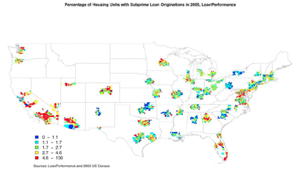
Subprime originations relative to housing units. To explore the geographic dispersion of subprime lending, we examine maps of the largest 100 MSAs in 2005 ranked by population (Figures 2 - 4). Subprime loans were originated throughout the country in this year. We divide Zip codes into quintiles based on the number of subprime originations in 2005 relative to housing units in the 2000 Census. The patterns described below are similar across the three subprime measures.
The most striking pattern is the extent to which subprime lending was more prevalent in some locations than others. The cutoffs for the quintiles in Figure 2, based on the LP measure, range from 1.1 subprime originations per 100 housing units and below for the lowest quintile (shaded in dark blue) to 4.6 and above for the highest quintile (marked in red).7 Concentrations in red are especially pronounced in the west, with Los Angeles (especially Riverside County), Las Vegas, Phoenix, Fresno, Denver, and Salt Lake City showing high concentrations of subprime loans. In the south, much of Florida and Atlanta also exhibit high concentrations of subprime lending. Cities in the Midwest and the Northeast had less subprime lending, although even markets less traditionally linked with subprime lending, such as Chicago, Providence, Minneapolis, Norfolk, and Washington, D.C., have somewhat high portions of red shading. We list the subprime concentrations using the LP measure for all 50 states and the top 100 MSAs by population in Tables 3 and 4.
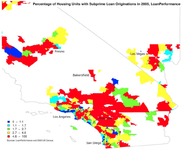
The maps and tables suggest a couple findings regarding the dispersion of subprime lending. We establish these correlations more conclusively in the later regression analyses. First, subprime loans are prevalent in locations with large amounts of new construction, consistent with a link between construction and the expansion of credit. Fast-growing metropolitan areas in states such as Nevada, Arizona, California, and Texas, appear to have lots of subprime originations. Even within metro areas, exurbs often have the highest subprime concentrations. This pattern is especially apparent in California where the outlying Los Angeles suburbs and the so-called "Inland Empire" of Riverside and San Bernandino counties have large red concentrations (Figure 5). Although not readily apparent from the national map, a similar although more muted pattern exists in other areas, such as the ring at the edge of the Boston metro area and outlying parts of New Jersey.
Second, there is an apparent link between house price appreciation and subprime lending, but the correspondence is certainly not one-for-one. While California, Las Vegas, and Miami saw high rates of appreciation and a great concentration of subprime lending, parts of the Northeast had high rates of house price appreciation but moderate numbers of subprime originations. Similarly, Atlanta had a high concentration of subprime lending in 2005 but relatively little house price appreciation compared with other locations. Third, some locations such as Ohio or Michigan, that have received widespread attention due to large numbers of foreclosures, do not appear to have particularly large concentrations of subprime loans compared with other parts of the country.
Subprime originations relative to total originations. Our finding about the low prevalence of subprime originations in Ohio and Michigan turns out to depend on our choice of housing units rather total originations as the denominator. All previous papers in this literature have used total originations. We use housing units as the denominator because the availability of subprime loans may affect the decision to take out a loan as well as the decision of what type of loan to choose. For example, subprime loans may allow some individuals to become homeowners who would have otherwise stayed renters. Subprime loans may also allow some homeowners who would otherwise be liquidity constrained to extract cash from their properties.
When we measure subprime originations relative to total originations (tables 5 and 6), states and cities with depressed housing markets move up in the distribution. For example, house prices in Michigan appreciated 3 percent in 2005; Michigan ranked 17th among states in subprime originations relative to housing units, but 5th relative to originations.8 In the same year, house prices in California rose 21 percent; California ranked 3rd among states in subprime originations relative to housing units, but 16th relative to originations. Likewise, Memphis, Detroit, and Cleveland have a higher relative share of subprime originations relative to all originations than to housing units. However, some areas rank highly under both measures. Nevada has the highest share of subprime loans relative to both housing units and originations, and Bakersfield, CA ranks second among cities under both measures.
We hypothesize that areas with high house price appreciation and more new construction may have more mortgage activity of all kinds than areas with more depressed housing markets. More new residents may move to rapidly growing areas and purchase homes; more renters may transition to homeownership and more investors may purchase properties; more homeowners may extract their recent house price gains through cash-out refinancings. Because mortgage activity is elevated among both prime and subprime borrowers, subprime originations may be high relative to housing units, but not necessarily as a share of mortgage activity.
In contrast, mortgage activity is likely subdued in depressed housing markets: these markets do not attract new homeowners or investors, and existing homeowners have no house price gains to cash out in refinancings. As depressed housing markets often reflect difficult local labor market conditions, more residents of these areas may have trouble qualifying for prime mortgages. As a result, we expect subprime originations to be low relative to housing units, but perhaps higher relative to loan originations. We present evidence consistent with these hypotheses in later regression analyses.
However, we cannot rule out the possibility that subprime originations are high relative to housing units in fast-growing cities because of a timing issue: our loan measures are from 2005, whereas our measure of housing units is from 2000. In fast-growing cities, the number of housing units in 2000 may be significantly less than the number of units in 2005, and subprime loan originations will seem more prevalent than they really are.
4) Regression Analysis: Where are subprime loan shares the highest?
Next we formalize the analysis in the maps with regressions that examine the factors correlated with the prevalence of subprime loans in MSA Zip codes. Our goal is to describe the types of neighborhoods that saw the highest incidence of subprime lending; we are not asserting a causal relationship between these factors and these originations.
Summary Statistics. As we described the subprime measures earlier, we highlight here the other variables in our analysis (Table 7). As noted earlier, we measure Zip code income with dummy variables that indicate the quintile within the MSA that each Zip code's median income falls. Although we use these dummy variables in the regressions, we show the distribution of the Zip code median income by quintile in Table 7 to give a sense of the variability in the quintiles across MSAs. While the mean of the bottom income quintile is $15,300, the 10th percentile is $11,300 and the 90th percentile is $19,300. The highest income quintile averages $34,000, but ranges from $21,900 to $50,000. The variability of each income quintile rises with the income quintile.
Zip codes exhibit great skewness in the percentage of black and Hispanic residents. Although blacks and Hispanics on average represent 10.7 and 10.8 percent, respectively, of the Zip code residents, the medians are only 3.6 and 4.1 percent. The standard deviations of both variables exceed 16 percent.
The mean and median homeownership rates are 65.2 and 67.1 percent in our sample, slightly below the national homeownership rate of 68.9 percent in 2005. Once again, this measure is quite variable, with the 10th and 90th percentile of the distribution of homeownership rates ranging from 45 to 83 percent.
The mean unemployment rate is 5.0 percent, quite close to the national average of 5.1 percent, with relatively low variability across counties. However, the amount house prices appreciated in 2004, the year preceding our data, ranges from 0.5 to 17.1 percent, with a median of 5 percent. The variance (7.0 percent) is nearly as high as the mean (7.5 percent). Our measure of new home construction, permits per 100 housing units, also exhibits skewness. The mean number of permits (1.6) is above the median (1.1), with a 10th-90th range of 0.3 to 3.5.
Base regressions using LP data. We show first regressions that use LP subprime originations per 100 housing units as the dependent variable (Table 8). The specification in column (1) compares total subprime originations in each Zip code to originations in other Zip codes across the country.
Zip codes in the bottom income quintile and Zip codes with higher shares of households in the middle credit category had the highest proportion of subprime loans. A one standard deviation increase in the percentage of households with a VantageScore of 640-700 (3.1 percentage points) is associated with a 0.86 increase in the number of subprime originations per 100 housing units, a 24 percent increase relative to the sample average of 3.63. Borrowers with credit scores in this range are the typical market for subprime mortgages. The share of households in the lowest credit category appears to be less related to the number of subprime loans, possibly because the credit of households in this category was below the lending standards of many subprime lenders.
The positive and significant coefficient on the unemployment rate suggests that subprime originations were more prevalent in communities with adverse economic conditions. However, the order of magnitude is moderate: a one standard deviation increase in the unemployment rate (1.3 percentage points) is associated with an 0.22 increase in the number of subprime originations per 100 housing units, or a 6 percent increase relative to the sample mean. Locations with higher home ownership rates also had more subprime loans, with an elasticity close to 1-for-1: a one percent increase in home ownership rate is associated with an increase of 0.04 additional subprime loans per 100 housing units, about 1 percent of the sample mean.
Even controlling for credit scores and other Zip code characteristics, race and ethnicity appear to be strongly and statistically significantly related to the proportion of subprime loans. A 5.4 percentage point increase in the percent of non-Hispanic blacks - a 50 percent increase relative to the mean - is associated with an 8.3 percent increase in the share of subprime originations in the Zip code.9 A similar 5.4 percentage point increase in the percent of Hispanics - also a 50 percent increase relative to the mean - is associated with a 6.8 percent increase in proportion of subprime loans. However, skewness in the racial composition of Zip codes suggests that subprime originations are much more prevalent in Zip codes with large shares of minority residents. Moving from the median to the 90th percentile Zip code share of black and Hispanic residents (an increase from 3.6 to 30.5 and from 4.1 to 30.1 percent of residents, respectively), suggests an increase in subprime originations of 41.5 and 32.9 percent. However, without more information on borrowers' credit constraints and borrowing options, we cannot assess whether these subprime loans displaced lower-cost conventional loans in minority communities or provided additional credit where lending was not previously available.
We believe that we are the first researchers to document with the LoanPerformance data these differences in the incidence of subprime lending by neighborhood racial composition, although several researchers have found similar results with the HMDA data. Avery, Canner, and Cook (2005), Center for Responsible Lending (2006), and Consumer Federation of America (2006) show that minorities are more likely than whites to take out HMDA higher-priced mortgages. U.S. Department of Housing and Urban Development (2000), Scheessele (2002), and Calem, Gillen, and Wachter (2004) document that subprime loans as measured by the HUD lender list are more prevalent in minority neighborhoods. The differences across races generally persist in these studies even after controlling for borrower characteristics, although no study can control fully for all relevant variables. Our results are particularly striking given that they are the first to control for the distribution of credit scores in a Zip code in a consistent manner. Avery, Canner, and Cook find that the racial gap decreases substantially after controlling for the lending institution, but this result raises the further question of why minorities are served disproportionately by higher-priced lenders. The extent to which these differences across races represent steering, discrimination, or unobserved characteristics correlated with race remains an unsettled question.
Finally, the positive and statistically significant coefficients on lagged house price appreciation and new housing permits suggest an interrelationship between subprime lending and the housing boom. A one standard deviation increase in house price appreciation in the previous year is associated with a 39 percent increase in subprime loans, whereas a one standard deviation increase in lagged construction is associated with a 21 percent higher proportion of subprime loans. Other research has documented a relationship between subprime lending and the housing cycle. Mian and Sufi (2008) show that Zip codes where previously constrained borrowers subsequently received mortgage credit had higher rates of house price appreciation. Mayer and Sinai (2007) demonstrate that metropolitan areas with higher subprime originations had greater "excess" appreciation in price-to-rent ratios above fundamental values. The extent to which subprime lending helped cause this housing boom or was a consequence of it remains an open question.
When we compare Zip codes within an MSA in our MSA fixed effects specification (column 2), the results are similar to the across-MSA specification. The main exception is the coefficients on the various income quintiles, which suggest that subprime lending was most prevalent in Zip codes in the top income quintile, and was lower by about the same amount in Zip codes in the bottom four quintiles. As our income quintiles are defined relative to each MSA's distribution, it is a bit surprising that the income coefficients differ so much across the specifications with and without MSA fixed effects. However, the fact that the "% with low VantageScore" coefficient is so much larger in the specification with MSA fixed effects relative to the specification without fixed effects suggests that a correlation between income and credit score may underlie these results.10 The coefficient on "% with mid VantageScore" is about the same in the two specifications--large and statistically significant.
Coefficients on percent black and Hispanic residents remain nearly the same as in column (1). This result is striking given that racial and ethnic concentrations vary substantially across MSAs. We drop the controls for house price appreciation, housing permits, and unemployment in this specification, as these effects are primarily identified across MSAs.
The next four columns report the results from separate analyses for purchases and refinancings. In 2005, the year of our analysis, subprime purchases represent about 42 percent of originations in the LP data. Because purchases are a smaller share in the LP data, we expect the coefficients in the purchase regressions to be proportionately smaller than the coefficients in the refinancing regression if the correlation between the subprime measure and the covariates was the same for both purchases and refinancings. (Notice that the number of purchase loans plus refinancings sum to total originations, so that the sum of the coefficients in columns 3 and 5 adds to the coefficients in column 1, and similarly the sum of columns 2 and 4 equals column 6.)
Overall, the pattern of subprime lending appears roughly similar for purchase loans as for refinancing. While the income and credit score variables change a bit across the two mortgage purposes, the general pattern is similar. The race coefficients remain statistically and economically significant in all four specifications, as do those for home ownership rate and unemployment.
The major difference between purchase and refinance mortgages is that lagged construction has a stronger correlation with purchases than refinancings. The coefficient on lagged construction is larger for purchase loans, even though refinancings represent the bulk of the sample. Interestingly, however, locations with more new construction still appear to exhibit some additional refinancing activity, possibly because new units provide an additional base for refinancings.
Table 9 segments refinancing into "cash-out" and "not for cash out" categories. Strikingly, cash-out refinancings dominate the sample, with about 9 in 10 mortgage borrowers receiving some type of cash back. Even so, the coefficients appear to show similar patterns as in the other regressions.
Regressions with the HMDA Higher-priced and HUD Subprime Lender Measures. We next use the higher-priced and HUD lender measures of subprime originations relative to housing units as the dependent variables (Tables 10 and 11). Although the choice of subprime measure affects the estimates of the number of originations, as shown in Tables 1 and 2, this choice does not appear to affect the regression results substantively. The factors associated with the incidence of subprime lending are similar across all three measures. However, patterns may diverge more in other years of the data, when the number of subprime originations differs more across measures.
The regressions in Table 10 use HMDA higher-priced originations in 2005 per 100 housing units in 2000 as the dependent variable. Considerably more HMDA higher-priced loans were originated in 2005 than LP subprime loans, so we expect the coefficients in Table 10 to be on average 50 percent larger than those in Table 8. Indeed, most of the coefficients are somewhat larger in the first column of Table 10 relative to that column in Table 8. Smaller differences persist. For example, higher-priced loans are slightly over-represented relative to securitized subprime loans in the middle credit score category, but are relatively less prevalent in Zip codes with higher black and Hispanic populations. This latter result suggests that studies based on the LP data might show a larger incidence of subprime lending in minority neighborhoods than studies based on the higher-priced data. Higher-priced loans are also somewhat less represented in locations with higher unemployment rates and higher past house price appreciation.
We show regressions with the HUD measure of subprime lenders in Table 11. The mean number of loans originated by HUD subprime lenders is 3.93, about 8 percent more loans overall than in LP. Thus, coefficients in Table 11 would only be slightly larger than those in Table 8 if the measures of lending were closely comparable. In the first column, the only appreciable differences are that HUD subprime lenders seem more likely to lend in lower income Zip codes and less likely to lend in the worst credit score districts. Given the correlation between these two measures, such offsetting changes may well be due to random variation. Coefficients on other variables are quite similar.
Regressions with LP originations relative to all HMDA originations. Finally, we consider how our results would differ if we normalized LP subprime originations by all HMDA originations in 2005 (Table 12).11 The demographic factors associated with subprime originations are consistent with the earlier regressions: zip codes with more residents who are low-income, minorities, owner-occupiers, or unemployed, or who have poor credit, have more subprime originations. Adjusting for the fact that subprime mortgages are about 7.5 times more prevalent as a share of loan originations than of housing units, the magnitudes of the coefficients are about the same as in earlier regressions.
However, house price appreciation and construction permits play a small role in these regressions. A one standard deviation increase in house price appreciation is associated with a 5 percent increase in subprime originations as a share of all originations, compared to a 39 percent increase as a share of housing units. Likewise, a one standard deviation increase in housing permits is associated with a less than 1 percent increase in subprime originations relative to all originations, compared to a 21 percent increase relative to housing units. When we break out purchases and refinances separately, house price appreciation is positively associated only with refinances, whereas permits are positively associated only with purchase mortgages. We observed a similar but less dramatic pattern in the housing units specifications.
These regression results are consistent with our earlier conclusion, based on Tables 3 - 6, that subprime originations as a share of housing units appear to be more prominent in hot housing markets, whereas subprime originations as a share of all originations appear to be more prominent in depressed housing markets. In areas with hot housing markets, both prime and subprime originations may be elevated, and so subprime mortgages are high relative to housing units but not necessarily relative to originations. However, subprime originations may also appear high relative to housing units in hot housing markets because our 2000 measure of housing units understates by a greater degree the true 2005 level.
5) Conclusions and future research
We explore a number of thought-provoking patterns in the geographic dispersion of subprime lending. Subprime originations appear to be heavily concentrated in fast-growing parts of the country with considerable new construction, such as Florida, California, Nevada, and the Washington DC area. These locations saw house prices rise at faster-than-average rates relative to their own history and relative to the rest of the country. However, this link between construction, house prices, and subprime lending is not universal, as other markets with high house price growth such as the Northeast did not see especially high rates of subprime usage. Subprime loans were also heavily concentrated in Zip codes with more residents in the moderate credit score category and more black and Hispanic residents. Areas with lower income and higher unemployment had more subprime lending, but these associations are smaller in magnitude.
The measure that provides the most reliable estimate of subprime originations appears to differ over time. From the 1990s through the early 2000s, most subprime loans were originated by subprime specialists and fewer of these loans were securitized. For these years, the HUD measure appears to gauge subprime originations most reliably. Later, more subprime loans were originated by lenders that traditionally operated in the prime market, and more of these loans were securitized. For this period, the LP data may be the best choice. At the moment, both the HUD lender and the LP measures are likely to miss large shares of subprime originations: the LP data because securitization of subprime loans has dried up, and the HUD measure because many subprime specialists have gone out of business. For the time being, the HMDA higher-priced measure may provide the most comprehensive coverage.
Our results provide only hints of answers to many of the most important questions about the subprime crisis, leaving much room for future research. We find that subprime originations are more prevalent in black and Hispanic Zip codes, but do not, at this point, have data that allow us to confidently determine why that occurred. Some previous work has suggested that minorities have been underserved by mortgage markets in the past and that minorities are more likely to be credit constrained (Ladd, 1998, Charles and Hurst, 2002, Gabriel and Rosenthal, 2005). To the extent that subprime loans provided credit to underserved areas, either to obtain cash back on homes or to purchase new homes, such credit may have been a positive development for some borrowers. However, it is also possible that subprime loans were substituted for conventional loans, leaving some minority borrowers with higher cost credit than they might have otherwise received. Disentangling these two effects is an important task for future studies.
The link between subprime lending and new construction and house price appreciation is also intriguing. Although we do not make any causal claim in this paper, Mian and Sufi (2008) suggest that greater securitized subprime usage leads to house price appreciation. Mayer and Sinai (2007) find a correlation between subprime lending and higher price-rent ratios. However, neither analysis fully explains the puzzle of MSAs with high subprime concentrations such as Las Vegas and Miami where both new construction and house prices rose rapidly, while other MSAs with high subprime concentrations such as Houston and Atlanta saw high construction but not high rates of house price appreciation.
Finally, unlike previous studies, we focus on subprime originations as a share of housing units, not of total mortgage originations. Economically stressed states such as Michigan and Ohio had low rates of subprime lending relative to the number of housing units, but high rates relative to the number of originations. This finding suggests that the relatively small volume of lending that occurred in these states was disproportionately subprime. It is also consistent with our regression result that subprime originations were more prevalent in areas with higher unemployment rates. However, it does not resolve the issue of whether subprime mortgages provided valuable credit to credit-constrained households in these areas or amplified the existing economic stress.
Appendix: Merging Census Tract and Zip Code data
The following section describes how we merged tract-level data from HMDA and the Census to Zip-code level data from LoanPerformance.
We base the merge on a Zip code tabulation area (ZCTA) to census tract cross-walk from the Missouri Census Data Center (http://mcdc2.missouri.edu/websas/geocorr2k.html). ZCTAs are generalized representations of Zip codes developed by the Census Bureau to facilitate census tract-Zip code matches. Each ZCTA is composed of the census blocks (subunits of census tracts) that correspond to a given Zip code. If a census block spans Zip codes, some residents of that block may be assigned to the wrong Zip code. The file also excludes Zip codes created after January 2000 and changes to Zip code boundaries after that date. We use the ZCTA tabulation designed for the 2000 Census.
To carry out this merge, we aggregated the relevant HMDA variables to the census tract level, and then merged on the ZCTA definitions for each tract. If a census tract corresponds to more than one ZCTA, we create one observation for each census tract-ZCTA pair. We also include for each observation a weight provided by the Missouri Census Data Center that indicates what share of households in a given tract live in each ZCTA. Using this weight, we aggregate the census tracts to the ZCTA level, and merge on the Zip-code level LP data by the ZCTA variable. Because HMDA data are only comprehensive for counties within MSAs, we drop Zip codes that straddle MSA lines or lie entirely outside of an MSA.
We calculate the census-tract level variables that are percentage variables (such as "% of residents with low VantageScores") at the Zip code level once we have created the final dataset. That is, we aggregate the number of residents with low Vantage Scores and the number of total residents to the Zip code level, and then calculate the share. We believe that this procedure is more robust to outliers than calculating these percentage variables at the census tract level, and then aggregating to the Zip code level.
Avery, Robert, Kenneth Brevoort, and Glenn Canner. 2007a. "The 2006 HMDA Data." Federal Reserve Bulletin, Vol. 93.
_____. 2007b. "Opportunities and Issues In Using HMDA Data." Journal of Real Estate Research, 29(4):351-79.
Avery, Robert, Glenn Canner, and Robert Cook. 2005. "New Information Reported Under HMDA and Its Application in Fair Lending Enforcement." Federal Reserve Bulletin, 91(Summer): 344-94.
Bostic, Raphael, Kathleen Engel, Patricia McCoy, Anthony Pennington-Cross and Susan Wachter. 2008. "State and Local Anti-Predatory Lending Laws: The Effect of Legal Enforcement Mechanisms." Journal of Economics and Business, 60(1-2):47-66.
Brooks, Rick, and Constance Mitchell Ford. October 11, 2007. "The United States of Subprime." The Wall Street Journal, A1. Available at http://online.wsj.com/article/SB119205925519455321.html
Brooks, Rick, and Ruth Simon. December 3, 2007. "Subprime Debacle Traps Even Very Credit-Worthy." The Wall Street Journal, A1. Available at http://online.wsj.com/article/SB119662974358911035.html
Calem, Paul, K. Gillen, and Susan Wachter. (2004). "The Neighborhood Distribution of Subprime Mortgage Lending." Journal of Real Estate Finance and Economics, 29(4):393-410.
Center for Responsible Lending. 2006. "Unfair Lending: The Effect of Race and Ethnicity on the Price of Subprime Mortgages." Report issued May 2006.
Charles, Kerwin Kofi and Erik Hurst. 2002. "The Transition to Home Ownership and the Black-White Wealth Gap." Review of Economics and Statistics, 84(2):281-97.
Consumer Federation of America. 2006. "Subprime Locations: Patterns of Geographic Disparity in Subprime Lending." Report issued September 2006.
Demyanyk, Yuliya and Otto Van Hemert. 2008. "Understanding the Subprime Mortgage Crisis." SSRN Working Paper.
Gabriel, Stuart, and Stuart Rosenthal. 2005. "Homeownership in the 1980s and 1990s: Aggregate Trends and Racial Gaps." Journal of Urban Economics, 57(1):101-27.
Gerardi, Kristopher, Adam Hale Shapiro, and Paul S. Willen. 2007. "Subprime Outcomes: Risky Mortgages, Homeownership Experiences, and Foreclosures." Federal Reserve Bank of Boston Working Paper No. 07-15.
Inside Mortgage Finance. 2006. The 2006 Mortgage Market Statistical Annual. Bethesda, MD: Inside Mortgage Finance Publications, Inc.
Keys, Benjamin J., Tanmoy K. Mukherjee, Amit Seru and Vikrant Vig. 2008. "Did Securitization Lead to Lax Screening? Evidence from Subprime Loans." SSRN Working Paper.
Ladd, Helen. 1998. "Evidence on Discrimination in Credit Markets." Journal of Economic Perspectives. 1(Spring): 223-234.
Mayer, Christopher and Todd Sinai. 2007. "Housing and Behavioral Finance." Paper presented at the Federal Reserve Bank of Boston Conference "Implications of Behavioral Economics on Economic Policy" and forthcoming in a conference volume.
Mian, Atif and Amir Sufi. 2008. "The Consequences of Mortgage Credit Expansion: Evidence from the 2007 Mortgage Default Crisis." University of Chicago mimeo, January.
Pennington-Cross, Anthony, and Giang Ho. 2006. "The Termination of Subprime Hybrid and Fixed Rate Mortgages." Federal Reserve Bank of St. Louis Working Paper 2006-042A.
Scheessele, Randall. 2002. "Black and White Disparities in Subprime Mortgage Refinance Lending." Housing Finance Policy Working Paper Series, HF-014. U.S. Department of Housing and Urban Development.
U.S. Department of Housing and Urban Development. 2000. Unequal Burden: Income and Racial Disparities in Subprime Lending in America. Available at http://www.huduser.org/Publications/pdf/unequal_full.pdf
| YEAR | HMDA Total | LP Total | HMDA Higher-Priced Total | HMDA HUD Total |
|---|---|---|---|---|
| 2004 | 10,959,872 | 1,725,466 | 1,575,342 | 2,070,631 |
| 2005 | 11,245,059 | 2,022,038 | 2,987,451 | 2,154,212 |
| 2006 | 9,887,994 | 1,547,155 | 2,855,954 | . |
| Total | 32,092,925 | 5,294,659 | 7,418,747 | 4,224,843 |
| YEAR | HMDA Refinance | LP Refinance | HMDA Higher-Priced Refinance | HMDA HUD Refinance |
|---|---|---|---|---|
| 2004 | 6,347,590 | 1,100,609 | 949,030 | 1,353,115 |
| 2005 | 6,089,788 | 1,182,615 | 1,521,854 | 1,197,396 |
| 2006 | 5,176,485 | 888,783 | 1,486,475 | . |
| Total | 17,613,863 | 3,172,007 | 3,957,359 | 2,550,511 |
| YEAR | HMDA Purchase | LP Purchase | HMDA Higher-Priced Purchase | HMDA HUD Purchase |
|---|---|---|---|---|
| 2004 | 4,612,282 | 624,857 | 626,312 | 717,516 |
| 2005 | 5,155,271 | 839,423 | 1,465,597 | 956,816 |
| 2006 | 4,711,509 | 658,372 | 1,369,479 | . |
| Total | 14,479,062 | 2,122,652 | 3,461,388 | 1,674,332 |
NOTES. Observations are loan originations. Sample is restricted to first liens on properties located in a metropolitan statistical area (MSA) that are not backed by manufactured housing or by buildings with more than four units. LoanPerformance (LP) are loans that were packaged into subprime mortgage pools. HMDA higher-priced are mortgages with an APR 3 or more percentage points above Treasury securities. HMDA HUD subprime are loans in the HMDA data originated by lenders on the HUD subprime lender list.
| Variable | Mean | 10 Percentile | Median | 90 Percentile |
|---|---|---|---|---|
| LP 2004 | 3.1 | 0.8 | 2.2 | 6.6 |
| LP 2005 | 3.6 | 0.9 | 2.5 | 7.8 |
| LP 2006 | 2.8 | 0.7 | 1.9 | 5.9 |
| LP Total | 3.2 | 0.8 | 2.2 | 6.8 |
| Higher-Priced 2004 | 2.8 | 1.0 | 2.3 | 5.4 |
| Higher-Priced 2005 | 5.4 | 1.7 | 3.9 | 10.9 |
| Higher-Priced 2006 | 5.2 | 1.7 | 3.7 | 10.3 |
| Higher-Priced Total | 4.5 | 1.3 | 3.2 | 9.0 |
| HUD 2004 | 3.7 | 1.2 | 2.7 | 7.5 |
| HUD 2005 | 3.9 | 1.1 | 2.6 | 8.3 |
| HUD Total | 3.8 | 1.1 | 2.7 | 7.8 |
| Variable | Mean | 10 Percentile | Median | 90 Percentile |
|---|---|---|---|---|
| LP 2004 | 1.1 | 0.2 | 0.7 | 2.5 |
| LP 2005 | 1.5 | 0.3 | 1.0 | 3.4 |
| LP 2006 | 1.2 | 0.2 | 0.8 | 2.6 |
| LP Total | 1.3 | 0.2 | 0.8 | 2.8 |
| Higher-Priced 2004 | 1.3 | 0.4 | 0.9 | 2.6 |
| Higher-Priced 2005 | 2.9 | 0.7 | 1.9 | 6.2 |
| Higher-Priced 2006 | 2.7 | 0.7 | 1.8 | 5.7 |
| Higher-Priced Total | 2.3 | 0.5 | 1.5 | 4.8 |
| HUD 2004 | 1.3 | 0.2 | 0.8 | 3.0 |
| HUD 2005 | 1.7 | 0.3 | 1.0 | 4.1 |
| HUD Total | 1.5 | 0.3 | 0.9 | 3.6 |
| Variable | Mean | 10 Percentile | Median | 90 Percentile |
|---|---|---|---|---|
| LP 2004 | 2.0 | 0.5 | 1.4 | 4.1 |
| LP 2005 | 2.1 | 0.6 | 1.4 | 4.5 |
| LP 2006 | 1.6 | 0.4 | 1.1 | 3.4 |
| LP Total | 1.9 | 0.5 | 1.3 | 4.0 |
| Higher-Priced 2004 | 1.6 | 0.6 | 1.3 | 2.9 |
| Higher-Priced 2005 | 2.5 | 0.9 | 1.9 | 5.0 |
| Higher-Priced 2006 | 2.5 | 0.9 | 1.9 | 4.8 |
| Higher-Priced Total | 2.2 | 0.7 | 1.7 | 4.2 |
| HUD 2004 | 2.3 | 0.8 | 1.8 | 4.4 |
| HUD 2005 | 2.1 | 0.7 | 1.5 | 4.2 |
| HUD Total | 2.2 | 0.7 | 1.6 | 4.3 |
NOTES. Observations are Zip codes. Sample is restricted to first liens on properties located in a metropolitan statistical area (MSA) that are not backed by manufactured housing or by buildings with more than four units. LoanPerformance (LP) are loans that were packaged into subprime mortgage pools. HMDA higher-priced are mortgages with an APR 3 or more percentage points above Treasury securities. HMDA HUD subprime are loans in the HMDA data originated by lenders on the HUD subprime lender list.
| STATE | # Subprime Loans / # Units |
|---|---|
| NV | 0.100 |
| AZ | 0.077 |
| CA | 0.071 |
| FL | 0.062 |
| RI | 0.062 |
| MD | 0.061 |
| DC | 0.052 |
| IL | 0.048 |
| NJ | 0.043 |
| GA | 0.040 |
| UT | 0.039 |
| CT | 0.038 |
| CO | 0.037 |
| VA | 0.036 |
| WA | 0.035 |
| MA | 0.034 |
| MI | 0.034 |
| MN | 0.034 |
| MO | 0.034 |
| ID | 0.033 |
| OR | 0.033 |
| DE | 0.032 |
| NY | 0.032 |
| TX | 0.031 |
| TN | 0.030 |
| WI | 0.030 |
| NH | 0.029 |
| ME | 0.028 |
| OH | 0.026 |
| WY | 0.026 |
| IN | 0.025 |
| KS | 0.021 |
| MS | 0.021 |
| NM | 0.021 |
| NC | 0.021 |
| OK | 0.021 |
| SC | 0.020 |
| IA | 0.019 |
| KY | 0.019 |
| NE | 0.019 |
| PA | 0.019 |
| AL | 0.018 |
| LA | 0.018 |
| AR | 0.017 |
| SD | 0.014 |
| VT | 0.014 |
| MT | 0.012 |
| ND | 0.012 |
| WV | 0.009 |
| Total | 0.041 |
| Rank | MSA | # Subprime Loans / # Units |
|---|---|---|
| 1 | Riverside, CA | 0.14 |
| 2 | Bakersfield, CA | 0.13 |
| 3 | Stockton, CA | 0.12 |
| 4 | Las Vegas, NV | 0.12 |
| 5 | Modesto, CA | 0.11 |
| 6 | Fresno, CA | 0.10 |
| 7 | Visalia, CA | 0.09 |
| 8 | Phoenix, AZ | 0.09 |
| 9 | Cape Coral, FL | 0.09 |
| 10 | Orlando, FL | 0.08 |
| 11 | Miami, FL | 0.08 |
| 12 | Sacramento, CA | 0.08 |
| 13 | Los Angeles, CA | 0.07 |
| 14 | Washington DC, DC-VA-MD-WV | 0.06 |
| 15 | Chicago, IL-IN-WI | 0.06 |
| 16 | Providence, RI-MA | 0.05 |
| 17 | Tampa, FL | 0.05 |
| 18 | New Haven, CT | 0.05 |
| 19 | Baltimore, MD | 0.05 |
| 20 | Atlanta, GA | 0.05 |
| 21 | Jacksonville, FL | 0.05 |
| 22 | San Diego, CA | 0.05 |
| 23 | Milwaukee, WI | 0.05 |
| 24 | Palm Bay, FL | 0.05 |
| 25 | Virginia Beach, VA-NC | 0.04 |
| 26 | Oxnard, CA | 0.04 |
| 27 | Detroit, MI | 0.04 |
| 28 | Houston, TX | 0.04 |
| 29 | Tucson, AZ | 0.04 |
| 30 | Worcester, MA | 0.04 |
| 31 | Memphis, TN-MS-AR | 0.04 |
| 32 | New York, NY-NJ-PA | 0.04 |
| 33 | Salt Lake City, UT | 0.04 |
| 34 | Denver, CO | 0.04 |
| 35 | Poughkeepsie, NY | 0.04 |
| 36 | Sarasota, FL | 0.04 |
| 37 | Colorado Springs, CO | 0.04 |
| 38 | Portland, OR-WA | 0.04 |
| 39 | Seattle, WA | 0.04 |
| 40 | Lakeland, FL | 0.04 |
| 41 | Boise City, ID | 0.04 |
| 42 | San Francisco, CA | 0.04 |
| 43 | Springfield, MA | 0.04 |
| 44 | Minneapolis St Paul, MN-WI | 0.04 |
| 45 | Bridgeport, CT | 0.04 |
| 46 | Dallas, TX | 0.04 |
| 47 | Kansas City, MO-KS | 0.04 |
| 48 | Ogden, UT | 0.04 |
| 49 | St Louis, MO-IL | 0.03 |
| 50 | Hartford, CT | 0.03 |
| 51 | Richmond, VA | 0.03 |
| 52 | Boston, MA-NH | 0.03 |
| 53 | San Jose, CA | 0.03 |
| 54 | Cleveland, OH | 0.03 |
| 55 | Nashville, TN | 0.03 |
| 56 | Grand Rapids, MI | 0.03 |
| 57 | Charlotte, NC-SC | 0.03 |
| 58 | Charleston, SC | 0.03 |
| 59 | Indianapolis, IN | 0.03 |
| 60 | Columbus, OH | 0.03 |
| 61 | Spokane, WA | 0.03 |
| 62 | Santa Rosa, CA | 0.03 |
| 63 | San Antonio, TX | 0.03 |
| 64 | Akron, OH | 0.03 |
| 65 | Philadelphia, PA-NJ-DE-MD | 0.03 |
| 66 | Allentown, PA-NJ | 0.03 |
| 67 | Portland, ME | 0.03 |
| 68 | Dayton, OH | 0.03 |
| 69 | Knoxville, TN | 0.03 |
| 70 | Des Moines, IA | 0.03 |
| 71 | Austin, TX | 0.03 |
| 72 | Chattanooga, TN-GA | 0.03 |
| 73 | Cincinnati, OH-KY-IN | 0.03 |
| 74 | Raleigh, NC | 0.03 |
| 75 | Jackson, MS | 0.02 |
| 76 | Birmingham, AL | 0.02 |
| 77 | Albuquerque, NM | 0.02 |
| 78 | McAllen, TX | 0.02 |
| 79 | El Paso, TX | 0.02 |
| 80 | Oklahoma City, OK | 0.02 |
| 81 | Albany, NY | 0.02 |
| 82 | Ann Arbor, MI | 0.02 |
| 83 | Baton Rouge, LA | 0.02 |
| 84 | Omaha, NE-IA | 0.02 |
| 85 | Columbia, SC | 0.02 |
| 86 | Louisville, KY-IN | 0.02 |
| 87 | Corpus Christi, TX | 0.02 |
| 88 | Toledo, OH | 0.02 |
| 89 | Lexington-Fayette, KY | 0.02 |
| 90 | Youngstown, OH-PA | 0.02 |
| 91 | Tulsa, OK | 0.02 |
| 92 | New Orleans, LA | 0.02 |
| 93 | Scranton, PA | 0.02 |
| 94 | Greensboro, NC | 0.02 |
| 95 | York, PA | 0.02 |
| 96 | Little Rock, AR | 0.02 |
| 97 | Wichita, KS | 0.02 |
| 98 | Harrisburg, PA | 0.02 |
| 99 | Durham, NC | 0.02 |
| 100 | Madison, WI | 0.02 |
| 101 | Greenville, SC | 0.02 |
| 102 | Lancaster, PA | 0.02 |
| 103 | Augusta, GA-SC | 0.01 |
| 104 | Pittsburgh, PA | 0.01 |
| 105 | Rochester, NY | 0.01 |
| 106 | Syracuse, NY | 0.01 |
| 107 | Buffalo, NY | 0.01 |
| Total | 0.041 |
| STATE | Subprime Loans / Loans |
|---|---|
| NV | 0.25 |
| FL | 0.24 |
| MI | 0.24 |
| TX | 0.24 |
| TN | 0.23 |
| OH | 0.22 |
| AZ | 0.21 |
| IL | 0.21 |
| IN | 0.21 |
| MD | 0.21 |
| MS | 0.21 |
| MO | 0.21 |
| RI | 0.21 |
| CA | 0.19 |
| GA | 0.19 |
| NY | 0.19 |
| OK | 0.19 |
| CT | 0.18 |
| LA | 0.18 |
| NJ | 0.18 |
| AL | 0.17 |
| DC | 0.17 |
| DE | 0.16 |
| ME | 0.16 |
| MN | 0.16 |
| PA | 0.16 |
| SC | 0.16 |
| UT | 0.16 |
| WI | 0.16 |
| AR | 0.15 |
| CO | 0.15 |
| KS | 0.15 |
| KY | 0.15 |
| NE | 0.15 |
| WY | 0.15 |
| ID | 0.14 |
| IA | 0.14 |
| MA | 0.14 |
| NC | 0.14 |
| OR | 0.14 |
| VA | 0.14 |
| WA | 0.14 |
| NM | 0.13 |
| NH | 0.12 |
| SD | 0.10 |
| MT | 0.09 |
| VT | 0.08 |
| ND | 0.08 |
| WV | 0.08 |
| Total | 0.19 |
| MSA | # Subprime Loans / # Loans | ||||
|---|---|---|---|---|---|
| 1 | Memphis, TN-MS-AR | 0.34 | |||
| 2 | Bakersfield, CA | 0.34 | |||
| 3 | Visalia, CA | 0.32 | |||
| 4 | Fresno, CA | 0.31 | |||
| 5 | Detroit, MI | 0.29 | |||
| 6 | Miami, FL | 0.29 | |||
| 7 | Houston, TX | 0.28 | |||
| 8 | Riverside, CA | 0.28 | |||
| 9 | Jackson, MS | 0.27 | |||
| 10 | Las Vegas, NV | 0.27 | |||
| 11 | McAllen, TX | 0.27 | |||
| 12 | Cleveland, OH | 0.27 | |||
| 13 | San Antonio, TX | 0.26 | |||
| 14 | Stockton, CA | 0.26 | |||
| 15 | Orlando, FL | 0.25 | |||
| 16 | Cape Coral, FL | 0.24 | |||
| 17 | Jacksonville, FL | 0.24 | |||
| 18 | Milwaukee, WI | 0.24 | |||
| 19 | Dayton, OH | 0.23 | |||
| 20 | Tampa, FL | 0.23 | |||
| 21 | Lakeland, FL | 0.23 | |||
| 22 | Akron, OH | 0.23 | |||
| 23 | Chicago, IL-IN-WI | 0.23 | |||
| 24 | Dallas, TX | 0.23 | |||
| 25 | New Haven, CT | 0.22 | |||
| 26 | Kansas City, MO-KS | 0.22 | |||
| 27 | Phoenix, AZ | 0.22 | |||
| 28 | El Paso, TX | 0.22 | |||
| 29 | Chattanooga, TN-GA | 0.22 | |||
| 30 | Youngstown, OH-PA | 0.22 | |||
| 31 | Baltimore, MD | 0.22 | |||
| 32 | Corpus Christi, TX | 0.22 | |||
| 33 | Indianapolis, IN | 0.21 | |||
| 34 | Modesto, CA | 0.21 | |||
| 35 | St Louis, MO-IL | 0.21 | |||
| 36 | Birmingham, AL | 0.21 | |||
| 37 | Baton Rouge, LA | 0.21 | |||
| 38 | Los Angeles, CA | 0.21 | |||
| 39 | Poughkeepsie, NY | 0.20 | |||
| 40 | Atlanta, GA | 0.20 | |||
| 41 | Oklahoma City, OK | 0.19 | |||
| 42 | Providence, RI-MA | 0.19 | |||
| 43 | Tulsa, OK | 0.19 | |||
| 44 | Palm Bay, FL | 0.19 | |||
| 45 | Toledo, OH | 0.19 | |||
| 46 | Sacramento, CA | 0.19 | |||
| 47 | Columbus, OH | 0.19 | |||
| 48 | Grand Rapids, MI | 0.19 | |||
| 49 | New York, NY-NJ-PA | 0.19 | |||
| 50 | Springfield, MA | 0.19 | |||
| 51 | Knoxville, TN | 0.19 | |||
| 52 | Virginia Beach, VA-NC | 0.19 | |||
| 53 | Scranton, PA | 0.19 | |||
| 54 | New Orleans, LA | 0.18 | |||
| 55 | Sarasota, FL | 0.18 | |||
| 56 | Albany, NY | 0.18 | |||
| 57 | Philadelphia, PA-NJ-DE-MD | 0.18 | |||
| 58 | Nashville, TN | 0.18 | |||
| 59 | Columbia, SC | 0.17 | |||
| 60 | Tucson, AZ | 0.17 | |||
| 61 | Little Rock, AR | 0.17 | |||
| 62 | Worcester, MA | 0.17 | |||
| 63 | Cincinnati, OH-KY-IN | 0.17 | |||
| 64 | Hartford, CT | 0.17 | |||
| 65 | Omaha, NE-IA | 0.17 | |||
| 66 | Louisville, KY-IN | 0.17 | |||
| 67 | Augusta, GA-SC | 0.17 | |||
| 68 | Charlotte, NC-SC | 0.17 | |||
| 69 | Salt Lake City, UT | 0.17 | |||
| 70 | Minneapolis St Paul, MN-WI | 0.17 | |||
| 71 | Charleston, SC | 0.16 | |||
| 72 | Pittsburgh, PA | 0.16 | |||
| 73 | Richmond, VA | 0.16 | |||
| 74 | Des Moines, IA | 0.16 | |||
| 75 | Spokane, WA | 0.16 | |||
| 76 | Buffalo, NY | 0.15 | |||
| 77 | Colorado Springs, CO | 0.15 | |||
| 78 | Ogden, UT | 0.15 | |||
| 79 | Austin, TX | 0.15 | |||
| 80 | Denver, CO | 0.15 | |||
| 81 | Rochester, NY | 0.15 | |||
| 82 | Wichita, KS | 0.15 | |||
| 83 | Greensboro, NC | 0.15 | |||
| 84 | Washington DC, DC-VA-MD-WV | 0.15 | |||
| 85 | Boise City, ID | 0.15 | |||
| 86 | Allentown, PA-NJ | 0.14 | |||
| 87 | Bridgeport, CT | 0.14 | |||
| 88 | Oxnard, CA | 0.14 | |||
| 89 | Greenville, SC | 0.14 | |||
| 90 | Portland, OR-WA | 0.14 | |||
| 91 | San Diego, CA | 0.14 | |||
| 92 | Albuquerque, NM | 0.14 | |||
| 93 | Lexington, KY | 0.14 | |||
| 94 | Portland, ME | 0.14 | |||
| 95 | Seattle, WA | 0.13 | |||
| 96 | Boston, MA-NH | 0.13 | |||
| 97 | Syracuse, NY | 0.13 | |||
| 98 | Harrisburg, PA | 0.12 | |||
| 99 | Raleigh, NC | 0.12 | |||
| 100 | Ann Arbor, MI | 0.11 | |||
| 101 | San Francisco, CA | 0.11 | |||
| 102 | York, PA | 0.11 | |||
| 103 | San Jose, CA | 0.10 | |||
| 104 | Santa Rosa, CA | 0.10 | |||
| 105 | Lancaster, PA | 0.10 | |||
| 106 | Durham, NC | 0.10 | |||
| 107 | Madison, WI | 0.09 | |||
| Total | 0.20 | ||||
| Variable | Mean | SD | 10 %'tile | Median | 90 %'tile |
|---|---|---|---|---|---|
| Variable: LP Subprime / 100 Units | 3.6 | 3.8 | 0.9 | 2.5 | 7.8 |
| Variable: LP Subprime Purchases / 100 Units | 1.5 | 1.8 | 0.3 | 1.0 | 3.4 |
| Variable: LP Subprime Refinances / 100 Units | 2.1 | 2.3 | 0.6 | 1.4 | 4.5 |
| Variable: LP Subprime Refinances for Cash Out / 100 Units | 1.9 | 2.1 | 0.5 | 1.2 | 4.2 |
| Variable: LP Subprime Refinances Not for Cash Out / 100 Units | 0.2 | 0.2 | 0.0 | 0.2 | 0.5 |
| Variable: HMDA Higher-Priced Subprime / 100 Units | 5.4 | 5.0 | 1.7 | 3.9 | 10.9 |
| Variable: HMDA Higher-Priced Subprime Purchases / 100 Units | 2.6 | 3.1 | 0.6 | 1.7 | 5.9 |
| Variable: HMDA Higher-Priced Subprime Refinances / 100 Units | 2.7 | 2.3 | 1.0 | 2.1 | 5.4 |
| Variable: HMDA HUD Subprime / 100 Units | 3.9 | 3.9 | 1.1 | 2.7 | 8.4 |
| Variable: HMDA HUD Subprime Purchases / 100 Units | 1.7 | 2.2 | 0.3 | 1.0 | 4.1 |
| Variable: HMDA HUD Subprime Refinances / 100 Units | 2.2 | 2.0 | 0.7 | 1.6 | 4.4 |
| Variable: Income in Zip Codes in Bottom Income Quintile | 15.3 | 3.2 | 11.3 | 15.3 | 19.3 |
| Variable: Income in Zip Codes in Second Income Quintile | 19.2 | 3.5 | 15.2 | 18.7 | 23.9 |
| Variable: Income in Zip Codes in Third Income Quintile | 21.9 | 4.2 | 17.1 | 21.2 | 27.7 |
| Variable: Income in Zip Codes in Fourth Income Quintile | 25.3 | 6.0 | 18.6 | 24.4 | 32.9 |
| Variable: Income in Zip Codes in Top Income Quintile | 34.0 | 12.9 | 21.9 | 31.1 | 49.8 |
| Variable: % with Low VantageScore | 24.5 | 12.4 | 10.4 | 22.4 | 41.9 |
| Variable: % with Mid VantageScore | 12.8 | 3.1 | 8.6 | 12.9 | 16.5 |
| Variable: % Population Black | 10.7 | 17.7 | 0.4 | 3.6 | 30.5 |
| Variable: % Population Hispanic | 10.8 | 16.3 | 0.9 | 4.1 | 30.1 |
| Variable: % Ownership Rate | 65.2 | 14.8 | 45.3 | 67.1 | 82.6 |
| Variable: % Unemployment | 5.0 | 1.3 | 3.7 | 4.9 | 6.4 |
| Variable: HPI Appreciation in Previous Year | 7.4 | 7.0 | 0.5 | 5.0 | 17.1 |
| Variable: Lagged Permits in County / 100 Units | 1.6 | 1.5 | 0.3 | 1.1 | 3.5 |
NOTES. Observations are Zip codes. Sample is restricted to first liens on properties located in a metropolitan statistical area (MSA) that are not backed by manufactured housing or by buildings with more than four units. LoanPerformance (LP) are loans that were packaged into subprime mortgage pools. HMDA Higher-Priced are mortgages with an APR 3 or more percentage points above Treasury securities. HMDA HUD subprime are loans in the HMDA data originated by lenders on the HUD subprime lender list.
| (1)
Subprime Loans / 100 Units |
(2)
Subprime Loans / 100 Units |
(3) Subprime Purchases / 100 Units |
(4) Subprime Purchases / 100 Units |
(5) Subprime Refinances / 100 Units |
(6) Subprime Refinances / 100 Units |
|
|---|---|---|---|---|---|---|
| Median Income is in Bottom Quintile | 1.15** | -0.54** | 0.23** | -0.41** | 0.91** | -0.13* |
| S.E., Median Income is in Bottom Quintile | (9.86) | (-4.44) | (3.94) | (-6.60) | (13.72) | (-1.88) |
| Median Income is in Second Quintile | 0.52** | -0.69** | 0.030 | -0.47** | 0.48** | -0.22** |
| S.E., Median Income is in Second Quintile | (6.33) | (-7.59) | (0.71) | (-9.92) | (9.93) | (-4.26) |
| Median Income is in Third Quintile | 0.30** | -0.60** | 0.017 | -0.35** | 0.28** | -0.25** |
| S.E., Median Income is in Third Quintile | (3.89) | (-7.28) | (0.45) | (-8.23) | (6.19) | (-5.31) |
| Median Income is in Fourth Quintile | 0.07 | -0.39** | 0.013 | -0.18** | 0.059 | -0.21** |
| S.E., Median Income is in Fourth Quintile | (1.21) | (-5.96) | (0.41) | (-5.32) | (1.62) | (-5.66) |
| % with Low VantageScore | -0.002 | 0.056** | 0.010** | 0.035** | -0.012** | 0.020** |
| S.E., % with Low VantageScore | (-0.28) | (7.37) | (3.19) | (9.34) | (-2.99) | (4.71) |
| % with Mid VantageScore | 0.28** | 0.41** | 0.11** | 0.17** | 0.17** | 0.24** |
| S.E., % with Mid VantageScore | (16.01) | (22.80) | (13.18) | (18.32) | (15.81) | (22.97) |
| % Population Black | 0.056** | 0.045** | 0.018** | 0.011** | 0.038** | 0.034** |
| S.E., % Population Black | (17.25) | (13.97) | (12.65) | (7.33) | (17.04) | (16.03) |
| % Population Hispanic | 0.046** | 0.051** | 0.022** | 0.018** | 0.025** | 0.032** |
| S.E., % Population Hispanic | (13.47) | (13.21) | (13.23) | (10.04) | (12.46) | (14.19) |
| % Ownership Rate | 0.036** | 0.053** | 0.013** | 0.021** | 0.023** | 0.032** |
| S.E., % Ownership Rate | (15.16) | (22.82) | (11.22) | (17.55) | (16.27) | (23.63) |
| % Unemployed | 0.17** | 0.06** | 0.11** | |||
| S.E., % Unemployed | (6.28) | (4.61) | (6.96) | |||
| HPI Appreciation in Previous Year | 0.21** | 0.071** | 0.14** | |||
| S.E., HPI Appreciation in Previous Year | (28.37) | (19.17) | (32.81) | |||
| Lagged Permits in County / 100 Units | 0.51** | 0.29** | 0.22** | |||
| S.E., Lagged Permits in County / 100 Units | (18.24) | (18.98) | (15.39) | |||
| Constant | -6.94** | -6.94** | -2.79** | -2.93** | -4.18** | -4.03** |
| S.E., Constant | (-21.44) | (-24.16) | (-17.50) | (-19.78) | (-21.96) | (-23.97) |
| MSA Fixed Effects | No | Yes | No | Yes | No | Yes |
| Observations | 15,281 | 15,611 | 15,281 | 15,611 | 15,281 | 15,611 |
| R Squared | 0.45 | 0.57 | 0.33 | 0.43 | 0.46 | 0.60 |
| Mean of Dependent Variable | 3.63 | 3.63 | 1.51 | 1.51 | 2.13 | 2.13 |
NOTES. Observations are Zip codes. Sample is restricted to first liens on properties located in a metropolitan statistical area (MSA) that are not backed by manufactured housing or by buildings with more than four units. LoanPerformance (LP) are loans that were packaged into subprime mortgage pools. For the specifications without MSA fixed effects, we drop 330 Zip codes with missing unemployment rate or permit data.
| (1) Subprime Refinances for Cash Out / 100 Units | (2) Subprime Refinances for Cash Out / 100 Units |
(3) Subprime Refinances Not for Cash Out / 100 Units |
(4) Subprime Refinances Not for Cash Out / 100 Units |
||
|---|---|---|---|---|---|
| Median Income is in Bottom Quintile | 0.85** | -0.088 | 0.063** | -0.042** | |
| S.E., Median Income is in Bottom Quintile | (13.70) | (-1.34) | (8.93) | (-6.24) | |
| Median Income is in Second Quintile | 0.44** | -0.20** | 0.048** | -0.028** | |
| S.E., Median Income is in Second Quintile | (9.59) | (-4.02) | (9.14) | (-4.80) | |
| Median Income is in Third Quintile | 0.24** | -0.23** | 0.039** | -0.019** | |
| S.E., Median Income is in Third Quintile | (5.73) | (-5.26) | (8.19) | (-3.75) | |
| Median Income is in Fourth Quintile | 0.032 | -0.20** | 0.027** | -0.0082* | |
| S.E., Median Income is in Fourth Quintile | (0.95) | (-5.86) | (6.91) | (-1.93) | |
| % with Low VantageScore | -0.011** | 0.017** | -0.0012* | 0.0039** | |
| S.E., % with Low VantageScore | (-3.04) | (4.13) | (-1.80) | (9.20) | |
| % with Mid VantageScore | 0.15** | 0.21** | 0.016** | 0.024** | |
| S.E., % with Mid VantageScore | (15.43) | (22.34) | (15.07) | (21.15) | |
| % Population Black | 0.035** | 0.032** | 0.0031** | 0.0021** | |
| S.E., % Population Black | (16.85) | (16.12) | (14.75) | (10.01) | |
| % Population Hispanic | 0.023** | 0.031** | 0.0018** | 0.0014** | |
| S.E., % Population Hispanic | (12.32) | (14.45) | (10.75) | (6.57) | |
| % Ownership Rate | 0.021** | 0.028** | 0.0033** | 0.0035** | |
| S.E., % Ownership Rate | (15.38) | (22.32) | (19.61) | (26.91) | |
| % Unemployed | 0.10** | . | 0.0093** | . | |
| S.E., % Unemployed | (6.87) | . | (5.60) | . | |
| HPI Appreciation in Previous Year | 0.14** | . | -0.00012 | . | |
| S.E., HPI Appreciation in Previous Year | (34.69) | . | (-0.47) | . | |
| Lagged Permits in County / # Units | 0.19** | . | 0.029** | . | |
| S.E., Lagged Permits in County / # Units | (14.45) | . | (19.59) | . | |
| Constant | -3.87** | -3.61** | -0.31** | -0.42** | |
| S.E., Constant | (-21.66) | (-22.99) | (-18.18) | (-23.97) | |
| MSA Fixed Effects | No | Yes | No | Yes | |
| Observations | 15,281 | 15,611 | 15,281 | 15,611 | |
| R Squared | 0.48 | 0.61 | 0.21 | 0.34 | |
| Mean of Dependent Variable | 1.9 | 1.9 | 0.22 | 0.22 | |
| (1) Subprime Loans / 100 Units |
(2) Subprime Loans / 100 Units |
(3) Subprime Purchases / 100 Units |
(4) Subprime Purchases / 100 Units |
(5) Subprime Refinances / 100 Units |
(6) Subprime Refinances / 100 Units |
|
|---|---|---|---|---|---|---|
| Median Income is in Bottom Quintile | 1.59** | -0.67** | 0.57** | -0.59** | 1.02** | -0.09 |
| S.E., Median Income is in Bottom Quintile | (9.83) | (-3.92) | (5.34) | (-5.22) | (15.54) | (-1.24) |
| Median Income is in Second Quintile | 0.88** | -0.72** | 0.26** | -0.62** | 0.62** | -0.11** |
| S.E., Median Income is in Second Quintile | (7.56) | (-5.44) | (3.35) | (-7.04) | (12.50) | (-1.99) |
| Median Income is in Third Quintile | 0.59** | -0.60** | 0.18** | -0.47** | 0.42** | -0.12** |
| S.E., Median Income is in Third Quintile | (5.14) | (-4.85) | (2.36) | (-5.65) | (8.63) | (-2.46) |
| Median Income is in Fourth Quintile | 0.18** | -0.44** | 0.05 | -0.30** | 0.14** | -0.14** |
| S.E., Median Income is in Fourth Quintile | (2.09) | (-4.79) | (0.78) | (-4.89) | (3.68) | (-3.83) |
| % with Low VantageScore | -0.023** | 0.063** | -0.012** | 0.035** | -0.012** | 0.027** |
| S.E., % with Low VantageScore | (-2.49) | (5.99) | (-2.03) | (5.11) | (-2.83) | (6.29) |
| % with Mid VantageScore | 0.49** | 0.64** | 0.27** | 0.37** | 0.21** | 0.27** |
| S.E., % with Mid VantageScore | (20.30) | (25.95) | (17.92) | (22.01) | (19.52) | (25.76) |
| % Population Black | 0.065** | 0.043** | 0.030** | 0.016** | 0.036** | 0.028** |
| S.E., % Population Black | (14.57) | (9.53) | (11.70) | (5.59) | (14.96) | (12.61) |
| % Population Hispanic | 0.058** | 0.066** | 0.043** | 0.041** | 0.015** | 0.025** |
| S.E., % Population Hispanic | (12.67) | (12.84) | (14.53) | (12.29) | (8.15) | (11.84) |
| % Ownership Rate | 0.058** | 0.082** | 0.028** | 0.043** | 0.031** | 0.040** |
| S.E., % Ownership Rate | (17.40) | (25.42) | (12.80) | (19.74) | (21.68) | (29.67) |
| % Unemployed | 0.19** | . | 0.11** | . | 0.09** | . |
| S.E., % Unemployed | (5.17) | . | (4.38) | . | (5.56) | . |
| HPI Appreciation in Previous Year | 0.26** | . | 0.14** | . | 0.12** | . |
| S.E., HPI Appreciation in Previous Year | (25.27) | . | (20.53) | . | (29.76) | . |
| Lagged Permits in County / 100 Units | 0.83** | . | 0.56** | . | 0.28** | . |
| S.E., Lagged Permits in County / 100 Units | (20.47) | . | (19.59) | . | (18.14) | . |
| Constant | -10.13** | -10.32** | -5.60** | -5.72** | -4.57** | -4.65** |
| S.E., Constant | (-22.49) | (-25.95) | (-18.70) | (-21.45) | (-24.93) | (-27.61) |
| MSA Fixed Effects | No | Yes | No | Yes | No | Yes |
| Observations | 15,281 | 15,611 | 15,281 | 15,611 | 15,281 | 15,611 |
| R Squared | 0.45 | 0.58 | 0.37 | 0.49 | 0.48 | 0.63 |
| Mean of Dependent Variable | 5.38 | 5.38 | 2.84 | 2.84 | 2.54 | 2.54 |
NOTES. Observations are Zip codes. Sample is restricted to first liens on properties located in a metropolitan statistical area (MSA) that are not backed by manufactured housing or by buildings with more than four units. Higher-priced are mortgages in the HMDA data with an APR 3 or more percentage points above Treasury securities. For the specifications without MSA fixed effects, we drop 330 Zip codes with missing unemployment rate or permit data.
| (1) Subprime Loans / 100 Units |
(2) Subprime Loans / 100 Units |
(3) Subprime Purchases / 100 Units |
(4) Subprime Purchases / 100 Units |
(5) Subprime Refinances / 100 Units |
(6) Subprime Refinances / 100 Units |
|
|---|---|---|---|---|---|---|
| Income in Bottom Quintile | 1.39** | -0.53** | 0.48** | -0.45** | 0.92** | -0.08 |
| S.E., Income in Bottom Quintile | (10.67) | (-4.21) | (6.03) | (-6.02) | (15.26) | (-1.33) |
| Income in Second Quintile | 0.77** | -0.63** | 0.21** | -0.51** | 0.56** | -0.11** |
| S.E., Income in Second Quintile | (8.46) | (-6.35) | (3.87) | (-8.70) | (12.51) | (-2.41) |
| Income in Third Quintile | 0.47** | -0.54** | 0.11** | -0.41** | 0.36** | -0.13** |
| S.E., Income in Third Quintile | (5.52) | (-6.04) | (2.25) | (-7.69) | (8.54) | (-3.14) |
| Income in Fourth Quintile | 0.15** | -0.40** | 0.04 | -0.25** | 0.11** | -0.15** |
| S.E., Income in Fourth Quintile | (2.21) | (-5.80) | (1.01) | (-6.07) | (3.30) | (-4.45) |
| % with Low VantageScore ( |
-0.04** | 0.03** | -0.02** | 0.02** | -0.02** | 0.01** |
| S.E., % with Low VantageScore ( |
(-5.75) | (3.58) | (-5.42) | (3.42) | (-5.24) | (3.34) |
| % with Mid VantageScore (640-700) | 0.35** | 0.49** | 0.17** | 0.25** | 0.18** | 0.24** |
| S.E., % with Mid VantageScore (640-700) | (19.58) | (27.15) | (16.63) | (23.23) | (19.16) | (26.46) |
| % Population Black | 0.06** | 0.04** | 0.03** | 0.02** | 0.03** | 0.03** |
| S.E., % Population Black | (16.56) | (12.47) | (13.94) | (8.22) | (15.77) | (14.14) |
| % Population Hispanic | 0.06** | 0.06** | 0.04** | 0.04** | 0.02** | 0.03** |
| S.E., % Population Hispanic | (15.18) | (15.91) | (16.61) | (15.02) | (11.63) | (14.66) |
| % Ownership Rate | 0.04** | 0.06** | 0.02** | 0.03** | 0.03** | 0.03** |
| S.E., % Ownership Rate | (15.50) | (24.28) | (10.02) | (17.98) | (19.74) | (28.05) |
| % Unemployed | 0.17** | . | 0.09** | . | 0.08** | . |
| S.E., % Unemployed | (5.44) | . | (4.81) | . | (5.50) | . |
| HPI Appreciation in Previous Year | 0.23** | . | 0.10** | . | 0.13** | . |
| S.E., HPI Appreciation in Previous Year | (28.97) | . | (22.23) | . | (34.05) | . |
| Lagged Permits in County / 100 Units | 0.52** | . | 0.31** | . | 0.21** | . |
| S.E., Lagged Permits in County / 100 Units | (18.11) | . | (17.74) | . | (16.52) | . |
| Constant | -7.37** | -7.71** | -3.45** | -3.76** | -3.92** | -3.95** |
| S.E., Constant | (-21.07) | (-25.89) | (-16.73) | (-21.40) | (-23.46) | (-26.84) |
| MSA Fixed Effects | No | Yes | No | Yes | No | Yes |
| Observations | 15,281 | 15,611 | 15,281 | 15,611 | 15,281 | 15,611 |
| R Squared | 0.48 | 0.62 | 0.39 | 0.54 | 0.50 | 0.65 |
| Mean of Dependent Variable | 3.88 | 3.88 | 1.72 | 1.72 | 2.15 | 2.15 |
NOTES. Observations are Zip codes. Sample is restricted to first liens on properties located in a metropolitan statistical area (MSA) that are not backed by manufactured housing or by buildings with more than four units. HMDA HUD subprime are loans on the HMDA data originated by lenders on the HUD subprime lender list. For the specifications without MSA fixed effects, we drop 330 Zip codes with missing unemployment rate or permit data.
| (1)
Subprime Loans / 100 Total Loans |
(2)
Subprime Loans / 100 Total Loans |
(3) Subprime Purchases / 100 Total Loans |
(4) Subprime Purchases / 100 Total Loans |
(5) Subprime Refinances / 100 Total Loans |
(6) Subprime Refinances / 100 Total Loans |
||||
|---|---|---|---|---|---|---|---|---|---|
| Median Income is in Bottom Quintile | 5.64** | 3.16** | 0.88** | 0.20 | 4.75** | 2.96** | |||
| S.E., Median Income is in Bottom Quintile | (19.29) | (10.81) | (5.49) | (1.21) | (25.62) | (16.17) | |||
| Median Income is in Second Quintile | 3.40** | 1.60** | 0.41** | -0.27** | 3.00** | 1.87** | |||
| S.E., Median Income is in Second Quintile | (15.70) | (6.88) | (3.50) | (-2.00) | (20.59) | (12.86) | |||
| Median Income is in Third Quintile | 2.38** | 1.03** | 0.38** | -0.11 | 2.00** | 1.15** | |||
| S.E., Median Income is in Third Quintile | (12.74) | (5.42) | (3.76) | (-1.05) | (16.25) | (9.73) | |||
| Median Income is in Fourth Quintile | 1.36** | 0.62** | 0.39** | 0.09 | 0.96** | 0.53** | |||
| S.E., Median Income is in Fourth Quintile | (8.73) | (4.15) | (4.52) | (1.06) | (9.41) | (5.67) | |||
| % with Low VantageScore | 0.44** | 0.51** | 0.26** | 0.29** | 0.18** | 0.22** | |||
| S.E., % with Low VantageScore | (25.78) | (27.17) | (24.37) | (24.18) | (18.66) | (21.00) | |||
| % with Mid VantageScore | -0.09** | 0.14** | -0.07** | 0.02 | -0.02 | 0.12** | |||
| S.E., % with Mid VantageScore | (-1.98) | (3.38) | (-2.69) | (0.82) | (-0.62) | (4.93) | |||
| % Population Black | 0.18** | 0.20** | 0.05** | 0.05** | 0.13** | 0.15** | |||
| S.E., % Population Black | (18.75) | (21.62) | (9.37) | (8.36) | (22.94) | (29.43) | |||
| % Population Hispanic | 0.09** | 0.08** | 0.06** | 0.02** | 0.04** | 0.06** | |||
| S.E., % Population Hispanic | (14.77) | (11.67) | (14.78) | (6.15) | (9.59) | (11.92) | |||
| % Ownership Rate | 0.11** | 0.12** | 0.04** | 0.04** | 0.07** | 0.08** | |||
| S.E., % Ownership Rate | (19.96) | (23.19) | (11.38) | (14.02) | (20.88) | (23.52) | |||
| % Unemployed | 0.67** | . | 0.23** | . | 0.45** | . | |||
| S.E., % Unemployed | (9.17) | . | (5.57) | . | (10.26) | . | |||
| HPI Appreciation in Previous Year | 0.21** | . | -0.01 | . | 0.21** | . | |||
| S.E., HPI Appreciation in Previous Year | (17.55) | . | (-1.01) | . | (26.44) | . | |||
| Lagged Permits in County / 100 Units | 0.14** | . | 0.28** | . | -0.14** | . | |||
| S.E., Lagged Permits in County / 100 Units | (2.78) | . | (10.22) | . | (-4.65) | . | |||
| Constant | -9.49** | -8.252** | -3.53** | -3.521** | -5.96** | -4.730** | |||
| S.E., Constant | (-14.28) | (-14.68) | (-9.32) | (-10.44) | (-14.39) | (-13.28) | |||
| MSA Fixed Effects | No | Yes | No | Yes | No | Yes | |||
| Observations | 15,281 | 15,611 | 15,281 | 15,611 | 15,281 | 15,611 | |||
| R Squared | 0.37 | 0.43 | 0.35 | 0.42 | 0.33 | 0.40 | |||
| Mean of Dependent Variable | 27.95 | 27.95 | 10.61 | 10.61 | 17.33 | 17.33 | |||
NOTES. Observations are Zip codes. Sample is restricted to first liens on properties located in a metropolitan statistical area (MSA) that are not backed by manufactured housing or by buildings with more than four units. LoanPerformance (LP) are loans that were packaged into subprime mortgage pools. For the specifications without MSA fixed effects, we drop 330 Zip codes with missing unemployment rate or permit data.