FEDS Notes
December 20, 2024
New tools to monitor inflation in real time
Simon C. Smith and Alexander L. Wolman*
1. Introduction
"[...] the high inflation readings from the spring and early summer were disproportionately driven by a few sectors experiencing specific supply bottlenecks.[..] I am closely monitoring incoming data for any indications that the breadth of inflation pressures is rising." (Lael Brainard, 2021.)1
In the aftermath of the COVID-19 pandemic, inflation surged to levels not observed in the United States (US) for several decades; much but not all of the increase has now been unwound. Other countries have had similar experiences. Ascertaining whether inflation readings are consistent with a central bank's goals is important for determining appropriate monetary policy. If the macroeconomic environment has become more uncertain, real-time monitoring becomes even more critical.
While the macroeconomist's toolkit consists of a range of tools for monitoring for the onset of a recession – such as the Sahm rule, inverted yield curves and unemployment insurance claims – tools for monitoring in real time the evolution of the behavior of inflation mainly comprise time series filters, albeit many of them quite sophisticated. The post-pandemic inflationary surge illustrated why it is and will continue to be important to have tools to monitor the behavior of inflation.
To this end, we propose some simple additions to the toolkit. The key insight that we exploit relies on the low and stable inflationary regime that existed during the 25 years before the pandemic. During this period, there is a tight empirical relationship between inflation and a measure of asymmetry of the cross-sectional distribution of price changes that can serve as a benchmark against which to compare post-pandemic inflation readings.2 Our tools can therefore answer the questions: given the asymmetry in the underlying distribution of price changes, is a given month's inflation reading too high (or too low) to be consistent with the pre-pandemic relationship?
2. Pre-pandemic relationship between inflation and asymmetry
One might interpret the same high inflation reading very differently depending on whether it is driven by increases across many subcategories or is more idiosyncratic, driven by a few categories. The former is likely more concerning.
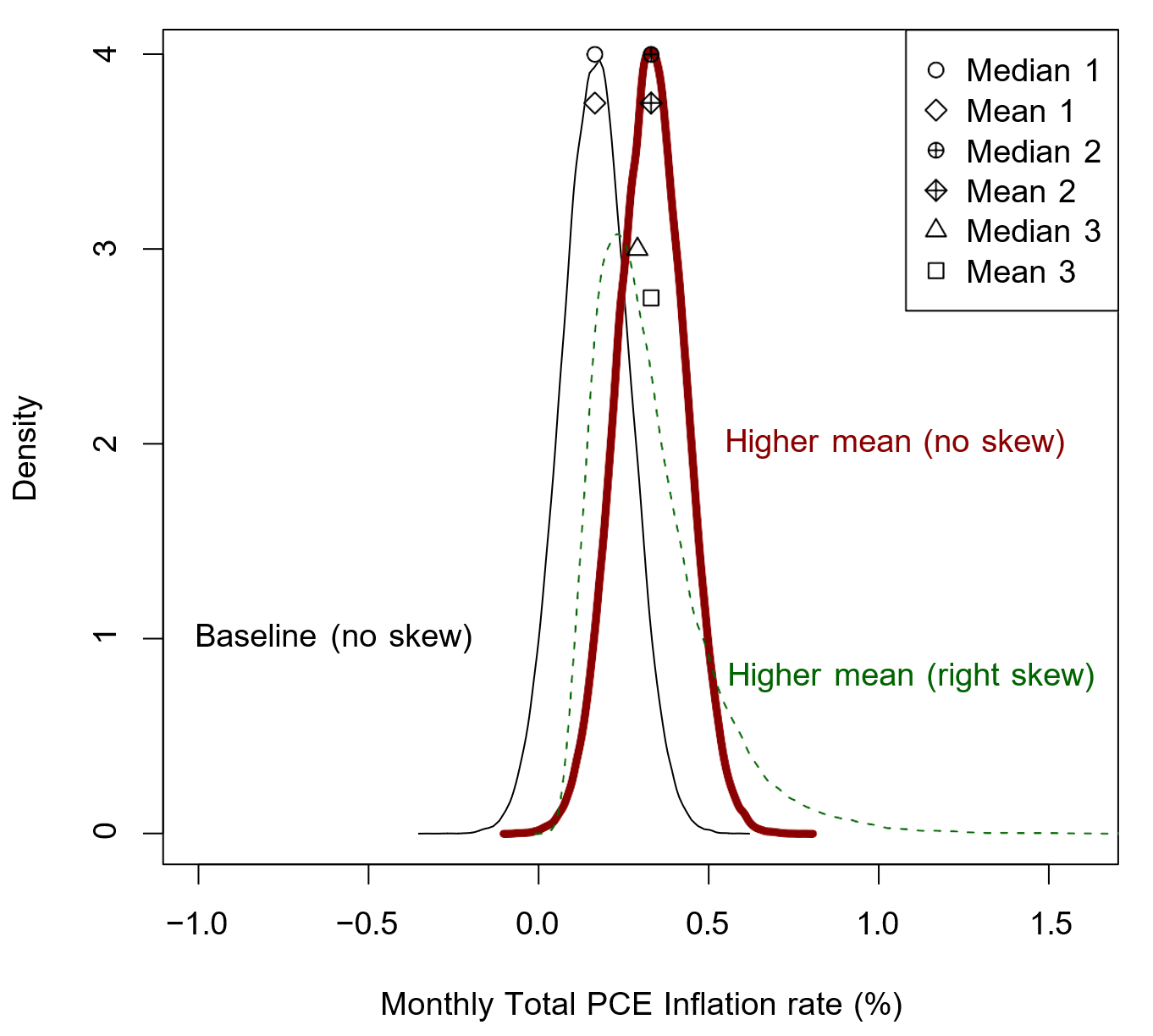
The total PCE inflation rate in a given month is approximately the (weighted) mean of the price changes in all the (200+) underlying categories that comprise the PCE price index, using the lowest level of disaggregation. As an illustrative example, the black line in Figure 1 displays a hypothetical baseline cross-sectional distribution of subcomponent price changes in a given month that is consistent with the annualized two percent inflation target; that is, the mean (hollow diamond) is about equal to a 0.16 monthly percent change. This distribution has no skewness and is hence symmetric such that the median (hollow circle) is equal to the mean. Now assume that the monthly inflation rate in the following two months is double this baseline value, but is obtained from two very different underlying distributions. In the first month, the higher mean (diamond with cross) is driven entirely by a higher median (circle with cross) as the entire distribution shifts to the right. This distribution (thick red line) therefore remains symmetric and so the mean is equal to the median. In the second month, the higher mean (square) is driven partly by a higher median (triangle) and partly by more weight in the right tail of the distribution or right skewness (dotted green line), which is reflected by the mean being above the median.
We leverage the following identity: Mean = Median + (Mean-Median). A higher overall PCE inflation rate (mean) that is driven by a higher median will be more concerning than one that is driven by increased right skewness (mean - median > 0). This is precisely the appeal of the median and other trimmed mean measures of inflation. Our novel insight is that from 1995 to 2020 – a period that we think is characterized by a low and stable inflation regime – the monthly inflation rate has a predictable relationship to a measure of skewness. Note that in any distribution the median will fall at the 50th percentile, by definition. The percentile of the distribution at which the mean falls will depend on the asymmetry of that distribution. For example, in a symmetric distribution – like the hypothetical ones illustrated by the black and red lines in Figure 1 – the mean will fall at the 50th percentile, like the median. For a distribution with right skewness, the mean will fall above the 50th percentile. For example, in the hypothetical distribution illustrated by the green line, the mean falls at the 58th percentile. On the other hand, in a distribution with left skewness the mean will lie below the 50th percentile.
Turning to the actual data, each of the grayed out circles in Figure 2 conveys this information using the total PCE price index for a given month from January 1995 through February 2020. Each month, the monthly total PCE inflation rate (y-axis) is plotted against our measure of asymmetry or skewness – the percentile of that month's cross-sectional distribution of price changes at which the mean falls – on the x-axis.
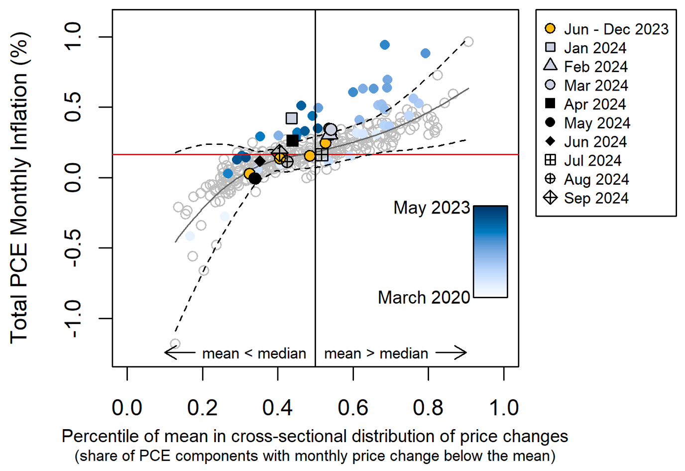
Note: Horizontal red line denotes monthly inflation consistent with 2 percent annual rate.
Source: Bureau of Economic Analysis.
There are three notable features to highlight. First, these observations are centered around the two percent annualized inflation target (horizontal red line). Second, monthly inflation has an upward-sloping nonlinear relationship with our measure of asymmetry from 1995 to 2020. The gray solid line plots the fit from a local polynomial regression on these data. These first two features imply that prior to the pandemic monthly inflation was (on average) close to target but would vary month-to-month, with a high monthly inflation reading typically reflecting price changes in a relatively small share of components. For example, total inflation might be high in a given month because of a spike in gasoline prices, while in a subsequent month it might be low because of a reversal in these prices.3 The tight empirical relationship between the level of inflation and our measure of asymmetry is reflected in a high R-squared of 0.77. Third, the 95 percent confidence interval (dotted black lines) is narrow when the mean is close to the median but wider when the mean is far from the median.
3. Interpreting inflation since March 2020
The tight pre-pandemic relationship and corresponding narrow confidence interval enables one to infer whether inflation is sufficiently broad-based that it can be deemed inconsistent with this pre-pandemic relationship (i.e. does the observation appear above the upper bound of the confidence interval). The recent inflationary surge that began in 2021 was initially confined to a small share of categories (light blue circles in the top-right of the chart), but subsequently percolated through the economy as high inflation became more broad-based (medium-blue circles shown in the top-middle). The strength of these latter readings was too broad-based to be consistent with pre-pandemic price behavior, falling above the pre-pandemic confidence interval. In other words, in the pre-pandemic period, an inflation reading this high would have been associated with high readings in a smaller share of categories (right skew).
Since May 2023, the behavior of prices has been largely consistent with the 1995 to 2020 period, aside from January 2024 which is a notable outlier. To see this more clearly, we plot the time series of monthly fitted inflation deviations, defined as the difference between actual inflation and the pre-pandemic fitted inflation rate based on Figure 2. The black line in Figure 3 is the time series for the difference between actual monthly inflation and the fitted value from the local polynomial regression (the gray line in Figure 2) given the level of asymmetry for that month. A positive deviation implies that, given the share of price changes below the mean in that month, inflation is higher than the pre-pandemic relation would have implied. The gray lines are the difference between actual inflation and the lower and upper bounds of the confidence interval.4 Consistent with the information in the scatter plot, apart from January 2024, in every month since May 2023 the 95 percent confidence interval around this monthly fitted deviation has either contained zero or not been far from it, indicating that for more than a year now the behavior of price changes of the entire distribution that underlies the total PCE price index has been mostly consistent with the relationship between the level of inflation and asymmetry observed from 1995 through 2020 when inflation was low and stable. Thus, if the inflationary surge that began in 2021 left one concerned about exiting the low and stable inflationary regime that existed until 2020, the last five quarters of data should provide some reassurance that this is not the case.
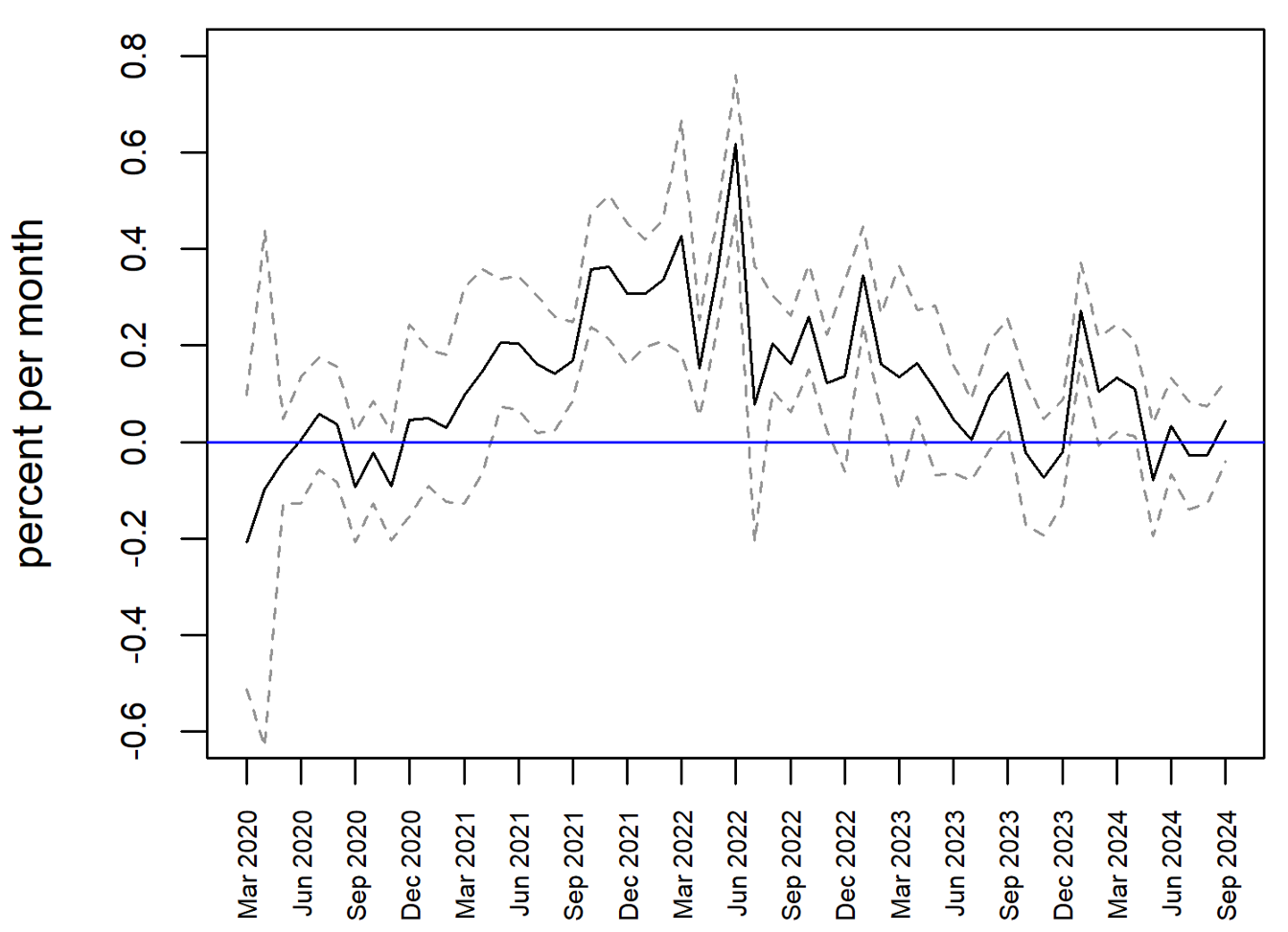
Note: Fitted inflation conditions on the share of relative price increases, using the pre-COVID relationship.
Source: Bureau of Economic Analysis.
Since monthly data is noisy, it can be helpful to smooth through the volatility in these monthly fitted inflation deviations. We therefore take a 12-month moving average of the monthly deviations (and confidence bands) and display this information in Figure 4. We refer to this moving average as the "Inflation Tracker". It has been steadily declining since peaking in the summer of 2022, though it remains somewhat elevated. Specifically, the 12- month average is 0.04 percent, equivalent to an annualized deviation from what the fitted value would have implied of 0.48 percent. Note however that the interval for the 12-month average has contained zero since the autumn of 2023. Focusing on the more recent data, the interval for the six-month average (not shown) has included zero for even longer, since the middle of 2023. In short, it cannot yet be said definitively that inflation is behaving exactly as it did pre-pandemic. However, the direction of travel is encouraging.
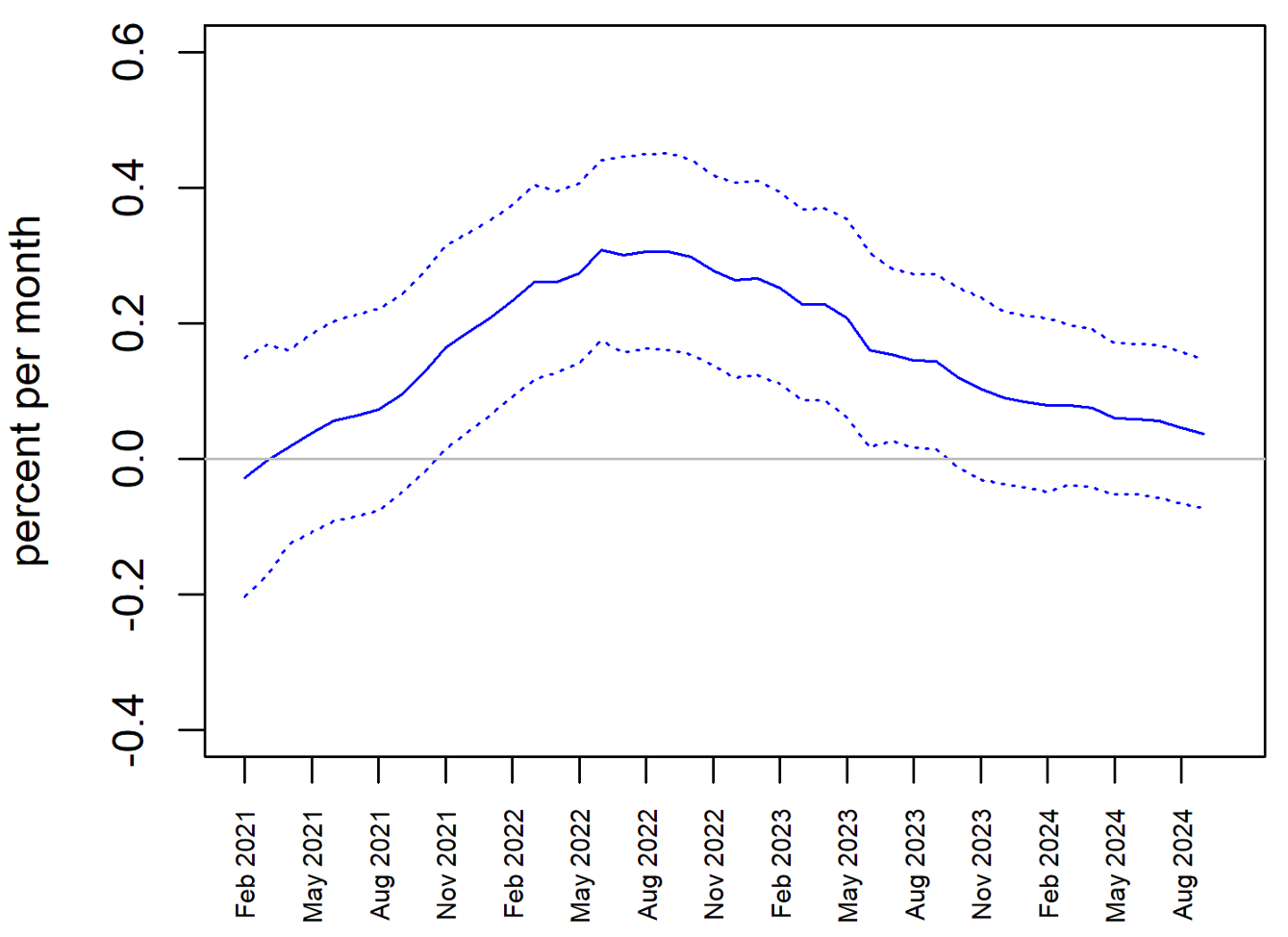
Note: Fitted inflation conditions on the share of relative price increases, using the pre-COVID relationship.
Source: Bureau of Economic Analysis.
Next, Figure 5 plots the "Inflation Tracker" (measured now in annualized deviations) along with the 12-month average deviations of inflation from its pre-COVID mean (January 1995 to February 2020) for total and core PCE inflation, which averaged 1.8 and 1.7 percent during this period. Our asymmetry measure averaged 0.46 during this period; interestingly, the fitted inflation rate evaluated at 0.46 is 2.00 percent.
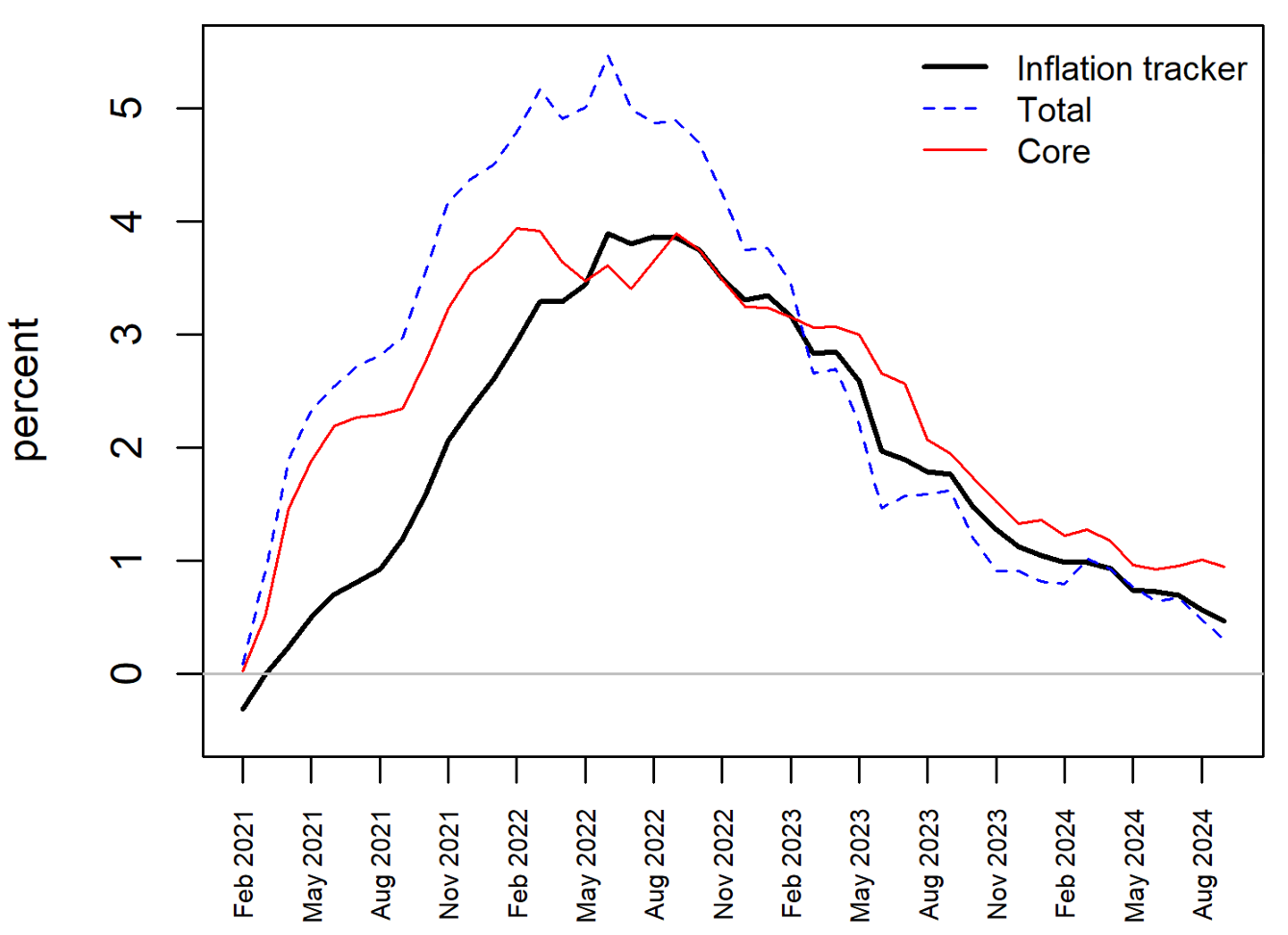
Note: Inflation tracker is actual minus predicted. Other measures are deviations from pre-COVID mean.
Source: Bureau of Economic Analysis.
As Figure 5 shows, during the recent inflationary surge total inflation moves up the earliest and peaks at the highest level. However, we know that some of its components (e.g. food and energy prices) can be especially volatile and are often driven by idiosyncratic or global factors that are not necessarily reflective of underlying broad-based inflationary pressures in the economy that optimal monetary policy should respond to. This is one reason why core inflation is often used to better gauge these inflationary pressures – it strips out the food and energy categories. For example, we see that core peaks in February 2022 while total continued rising over the subsequent months by almost another full percentage point, as Russia's invasion of Ukraine put upward pressure on food and energy prices. Overall, we see that during the recent inflationary episode core inflation moved up a little more slowly than total inflation and peaked at a lower level, suggesting that inflationary pressures did not rise as quickly or as high as would be suggested by total inflation.
Our approach moves up more slowly than core, but peaks at a similar level. The reason it moves up more slowly is because in the early part of the inflationary surge that began in 2021, the high inflation readings were confined to a small share of components that were not food and energy, as noted in the opening quote. For example, recall the COVID-induced lockdowns in Asia that caused a shortage of chips and put upward pressure on motor vehicle prices. These are the light-blue circles that appear not far from the fitted line in the upper- right part of the earlier scatterplot. Our tool interprets those observations as inflation rates that are not disconcertingly high given that the strength in that reading is confined to a relatively small share of components. As we move through 2021, however, the medium-blue circles in the upper-right part of the chart are now clearly above what was observed in the pre-pandemic period. This causes our fitted deviation to start moving up. While our approach lags core on the way up and peaks a little later, it moves down from its peak more quickly.
Just as the difference between the blue and red lines can be interpreted as the adjustment for tail behavior that arises from removing food and energy components, the difference between the blue and black lines can be interpreted as the adjustment for tail behavior that arises from our approach that accounts for asymmetry. For instance, the peak deviation in total inflation is about 5.25 percent in mid-2022, while the peak in our measure at the same time is about 3.75 percent. This suggests that about 30 percent of the post-pandemic surge in total inflation can be explained by our measure of asymmetry (tail behavior), while the remaining 70 percent can be attributed to broad-based increases (median shifting to the right.)
Right now, the different measures are all telling the same broad story: inflation is much closer to its pre-pandemic level than it was, but still has a little further to go. However, our approach suggests that a little more of the overshoot has been unwound relative to core.
In short, to the extent that our approach better adjusts for tail behavior than core (which strips out food and energy components) and total (which does no adjustment), it may provide a better gauge of the inflationary pressures in the economy.
Of course, annualized total PCE inflation averaged 1.8 percent from 1995 to 2020. As a result, inflation slightly above its pre-pandemic pace would still be consistent with two percent inflation.
4. Relationship to standard diffusion indexes
A common existing approach to interpret whether inflationary pressures are broad-based or idiosyncratic is the standard diffusion index that measures the share of subcomponents with price changes above an ad hoc threshold – say, a monthly annualized reading of three percent – that is fixed through time. As we shall show, the time-invariant nature of this threshold severely reduces the degree to which the standard inflation diffusion index can explain the inflation rate. Our approach can be thought of as a diffusion index in which the threshold is set equal to the mean (i.e. the aggregate inflation rate) each month, rather than a fixed number. As a result, our threshold is time-varying and this flexibility considerably improves the ability to explain the inflation rate.
To see the advantage over the standard diffusion index, consider two scenarios in which the share of price increases above three percent is unusually high. In one scenario, there is a shift in mass to the right tail of the price-change distribution, and the inflation rate is high. In another scenario, there is an increase in variance of the price-change distribution – more weight in both tails – and the inflation rate is constant. Our tool would take on different values and thus could explain both inflation outcomes, whereas the standard diffusion index would take on the same value and thus would be incapable of discerning between the two different inflation outcomes. This intuition is confirmed empirically in Figure 6, which shows the scatter plot of a diffusion index with a fixed three percent threshold against the level of monthly inflation during the January 1995 to February 2020 period. Notice how dispersed the circles are, even in the pre-pandemic period during which inflation was low and stable. This illustrates that using a fixed threshold of three percent rather than the mean reduces considerably the explanatory power over the inflation rate: the R-squared from an analogous local polynomial regression is just 0.1.
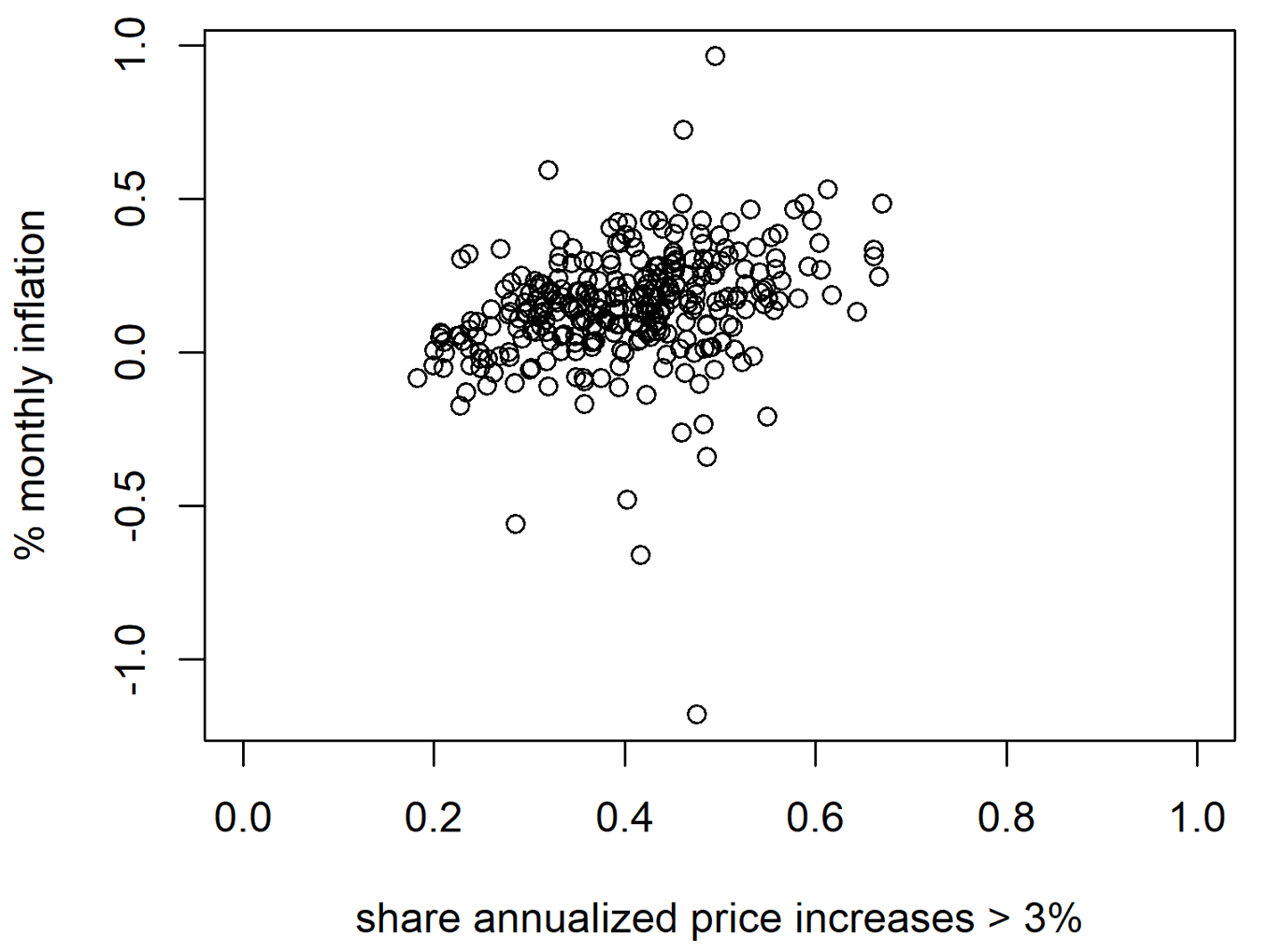
Source: Bureau of Economic Analysis.
A similar reduction in explanatory power occurs if we instead use a two percent threshold (not shown); there the R-squared is 0.16. While the standard diffusion index has some explanatory power over the inflation rate, it varies across time. This is because a threshold value of, say, three percent for the standard diffusion index might have been useful since 2021, but this would not have been useful from 1995 to 2020. It is not clear how and when to optimally reset this threshold, making the standard diffusion index more difficult to implement in practice.
Note that we can use the same relationship displayed in Figure 2 in its inverse form, to predict asymmetry using the inflation rate. This gives a complementary measure of how the two variables deviated from – and have now returned to – their pre-COVID stable relationship (see our "scale-free diffusion index" displayed in Figure 7.) Relative to the standard diffusion index which assumes a time-invariant ad hoc threshold, our threshold varies through time at a clear and meaningful value (the mean of the underlying distribution of price changes), taking the guesswork out of when to reset the threshold and which value to use.5
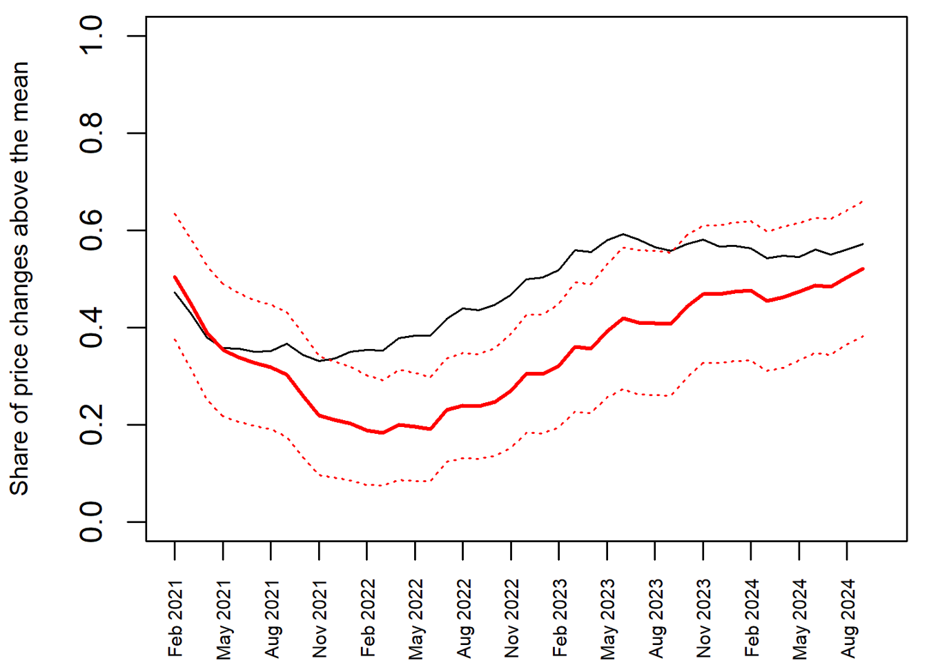
Note: The black line is the share of price increases above the mean, and the red line is the fitted share of price changes above the mean, conditional on the inflation rate and the pre-COVID relationship.
Source: Bureau of Economic Analysis.
5. Relationship to approaches that omit volatile categories
The Federal Reserve's two percent inflation target is defined in terms of total PCE inflation. In addition to using core as a way to reduce volatility and increase the signal from inflation readings, economists have used other exclusion indexes and central tendency statistical measures. For example, the Federal Reserve Bank of Dallas' trimmed mean measure strips out 24 percent of the weight from the lower tail and 31 percent of the weight from the upper tail. The Federal Reserve Bank of Cleveland's median PCE measure goes even further by focusing on only the median price change of all the subcomponents in a given month.6
The inherent challenge in evaluating the behavior of price changes is exacerbated when there are large changes in a small share of components. All the aforementioned existing approaches strip out certain components to remove the tails of the underlying distribution of price changes, thereby creating a new inflation rate. However, simply removing the tails in this manner (i) means the resulting measures might deviate persistently from the inflation measure for which the two percent inflation target is ultimately defined and (ii) opens them to criticism of cherry-picking.
An important advantage of our approach is that we use data on the entire distribution of price changes to construct a measure of asymmetry as a way of adjusting for tail behavior in this distribution. This measure of asymmetry is tightly related to the inflation rate during the pre-pandemic period in which inflation was low and stable, and we leverage this tight relationship to evaluate whether data in the post-pandemic period – when inflation rates could no longer be described as low and stable – are consistent with this relationship.
In conclusion, we think our tools are useful for monitoring in real time whether or not inflation is behaving in a manner that is consistent with the low and stable inflationary regime that existed for 25 years before the onset of the pandemic.
References
Ball, L. and Mankiw, N. G. (1995). Relative-price changes as aggregate supply shocks.
Quarterly Journal of Economics, 110 (1), 161–193.
Hornstein, A., Ruge-Murcia, F. and Wolman, A. L. (2024). The relationship between inflation and the distribution of relative price changes.
Luciani, M. and Trezzi, R. (2019). Comparing two measures of core inflation: PCE excluding food & energy vs. the trimmed mean PCE index.
* Email addresses: [email protected] (Simon C. Smith), [email protected] (Alexander L. Wolman)
The views expressed in this paper are those of the authors and do not necessarily reflect the views and policies of the Board of Governors of the Federal Reserve System or the Federal Reserve Bank of Richmond. The authors have no conflict of interest to declare. This paper is based on ongoing work by the second author with Andreas Hornstein and Francisco Ruge-Murcia.Return to text
1. This quote is from former Governor Lael Brainard's speech "Navigating Delta Headwinds on the Path to a Full Recovery", September 27, 2021. Return to text
2. See also Hornstein et al. (2024) and https://www.richmondfed.org/publications/research/economic_brief/2024/eb_24-09. Return to text
3. Ball and Mankiw (1995) also emphasized the relationship between inflation and measures of skewness in the distribution of relative price changes. Their focus was on a theoretical model that could deliver this relationship, as opposed to inferring whether real-time inflation data was consistent with a prior stable regime. Return to text
4. In March 2020, the deviation is close to zero because the observation falls close to the fitted value. However, the confidence interval is very wide because the degree of asymmetry that month was extreme (our statistic is just below 0.2). Return to text
5. Specifically, the solid red line graphs the benchmark 12-month moving average of the fitted weighted share of price changes above the mean in each month conditional on the corresponding inflation rate. The dashed red lines show the two standard deviation confidence interval. The black line corresponds to the actual data. Return to text
6. For a discussion and comparison of these two measures, see Luciani and Trezzi (2019), available at https://www.federalreserve.gov/econres/notes/feds-notes/comparing-two-measures-of-core-inflation-20190802.html. Return to text
Smith, Simon C., and Alexander L. Wolman (2024). "New tools to monitor inflation in real time," FEDS Notes. Washington: Board of Governors of the Federal Reserve System, December 20, 2024, https://doi.org/10.17016/2380-7172.3617.
Disclaimer: FEDS Notes are articles in which Board staff offer their own views and present analysis on a range of topics in economics and finance. These articles are shorter and less technically oriented than FEDS Working Papers and IFDP papers.
